Monday, October 27, 2008

Wander Lust, Photoshop CS4 and Some Excellent Bloggers

When my grandson lived with us, we packed him along on many of the trips we made. I still have this crystal clear image: this little three year old body waddling up to me, pulling on my pant leg until he had my complete attention, and then pointing off to the side.

“I think we should go havealook,” he’d say making very direct eye contact.

That’s not a typo, by the way. “Havealook” was all one word to Perrin. It meant: “There’s something over there I think we should see. Let’s go exploring. C’mon…let’s go havealook.”

The phrase stuck with Sheree and me. When are preparing for a trip and are going about the happy business of packing up the cameras and joyfully speculating about the things we’ll need to take and the challenges we might encounter, we’ll often tell each other we are going to “havealook.”

The word conjures up the kind of warm memories that make us smile.

I am just about dying to go havealook. It’s been nearly two months since we went somewhere and, while that may sound odd to you, I am suffering from travel withdrawal. It isn’t pretty. I gaze at images I took in Rome and New York and Hawaii and New Orleans and…and all those places…and I sigh.

Our next trip, which will take us down the Amazon River, doesn’t begin until New Year’s eve. Yup. While others are ringing in 2009, Sheree and I will be on a tarmac, waiting to take off. There’s something I really like about that. It fits who we are perfectly.

But for now, I am looking down the barrel of yet another Christmas season, fighting my way through the snow, performing show after show as I watch the days tick down one by one. Don’t get me wrong. I am happy doing magic shows but, you see, I have these progressively itchier feet. And they want to take me to places where I can make photographs and meet new people and be somewhere utterly new to me. Who am I to argue with my feet?

One of my favorite writers is Bill Bryson. In his classic book “Neither Here Nor There,” he writes with great passion about the joy of being in a place where they don’t speak your language, where their customs are completely different, where simply crossing the street is an adventure. That passage really speaks to my heart. There’s a wonder-lust that travels hand in hand with a travel lifestyle that creates a deep ache to explore this big wonderful world.

I am not talking about vacations. Nope. I am talking about TRAVEL: getting up with the sun, and watching dawn come up on an exotic place. I am talking about sipping your morning coffee made in a completely different way, the looks the locals give you when they realize you are valiantly trying to speak their language and the warm smiles they offer. I am talking about new smells and different art and architecture and history and people.

I am talking specifically about trying to think of how to convey that travel experience with a picture and going back to the hotel ONLY after it’s become too dark to take pictures…ignoring throbbing feet because you can hardly wait to see the images of the day…and (in my case anyway) share them with your partner.

I blame my wife for this, by the way. Sheree has infected me with a real desire to see the world and a very genuine ache to peek around the next bend in the world to havealook. I was a perfectly well mannered little hobbit who never had any nasty adventures at all before I met her.

Ahem.

**sigh**

CS4 Is Here!

I have been happily playing with Photoshop CS4 for about a week now. Ooops. Did I say “playing?” I actually meant, “Making a very serious and evaluative examination of this new digital editing software.”

It’s much faster than CS3 and it’s easier to use. That alone is worth the price of an upgrade, which is just a hair under two hundred bucks. There’s not a LOT of new stuff. It seems to me as though Adobe was looking to clear up many of the annoying things that made CS3 a wee bit of a pain to use.

I am especially taken with the Vibrance Adjustment Mask. If you own this software, or are playing with one of those nifty 30 day trials offered by Adobe, I think you’ll enjoy it too.

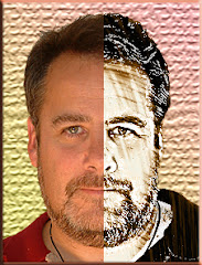
Here are two images. (It's an air traffic control tower we went to in Mexico. You can go to the top for one American Dollar...but don't get me started on that whole travel thing again) One has been treated with the Vibrance Mask…the other hasn't.
If you can't tell which is which, check your pulse. The differences are subtle but at least a 9 on the "Way Cool" scale.

Adobe didn’t make the one change I have been praying for. The most wonderful thing about Lightroom, to my mind, is that the Crop Tool features a changing Rule of Thirds grid, so you can get precise crops and really use your Dynamic Points. There are Photoshop plug-ins that sort of simulate it…and you COULD go from LR to Photoshop (which is the idea anyway) but every time a new edition of PS comes out, this is the first thing I look for.

Ah well.

Most of the rest of the changes are subtle but quite wonderful. Photoshoppers are in a tizzy of delight about CS4. In my humble opinion, it’s CS3 only way better.

Several of you have emailed and asked if I recommend upgrading. If you’re using CS2 or earlier…and you haven’t upgraded yet, you really need to give your head a shake. CS3 was a HUGE improvement on CS2. If you’re happy with CS3 being just a little clunky to use, wait for the next upgrade.

A FEW BLOG NOTES
I only read three blogs on a regular basis. They all have to do with Photography or Photoshop.
The first is by Sheree. She blogs for Picajet. If you’re interested in travel and travel photography, let me strongly suggest that you check her work out. I’d read it even if I wasn’t married to her.

The second that is becoming a HUGE favorite is by a friend of mine in Ireland. He’s Stephen Power and he’s been running a fascinating series on street photography as well as the nuts and bolts of being a professional photographer. You’ll find him intelligent and concise with a delightful writing style.

The superstar of Photoshop is Scott Kelby. Most of the things I have learned about Photoshop, I learned from his books. His blog is outstanding. He also runs NAPP – the National Association of Photoshop Professionals. I’ve been a member for years. It’s a fabulous resource for graphic artists of ALL skill levels. Membership is the best money you'll ever invest.

They are all well worth a read. The links to ALL are in the upper right hand corner of this blog. I’ve put them there instead of here, so you will always be able to find them.

See how I look out for you guys?

Monday, October 20, 2008

Making Junk Into Beautiful "Junque"

We were driving down a back road in Spruce Grove on an impromptu "photo safari" when my wife spun around and made an undignified squawking sound. This usually signals the fact that we have just driven by something that will make an awesome picture.

I was looking the other way, as is my custom.

“Did you see that?” she exclaimed.

“Ummm…” I began.

“There was a metal castle over there!”

“Were there flying monkeys circling the turrets?” I asked.

She didn’t respond to this extremely witty comment, but flipped the car around and drove back down the road. Sure enough, just inside a junk yard was this huge metal castle. I stifled my own squawking sound and grabbed my camera. The sun was just setting and there were ribbons of color in the sky, but the light was fading.

I started taking pictures: an abandoned bus out front of the junk yard, the weather-beaten signage and, of course, the metal castle. A big machine started rolling my way. In the cab was a little old guy who looked like he just might be the elf that lived in the castle.

I was half-right.

“Do you like my castle?” he asked, swinging down from the seat. He’s a genial guy who introduces himself as “Frank. Just Frank.”

I nod, taking a few more photographs just in case he's getting ready to kick me off his land.

“I made it,” he said. “I made that castle from scrap metal.”

His voice has a heavy Slavic accent but he regards the metal structure with a fondness I recognize as coming from someone who has built something that is seriously cool.

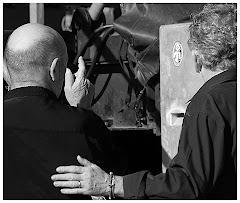
My eyes scan the area behind him. Cars in various stages of getting ripped up, junk metal, appliances and even a coffin are arranged in relatively neat piles on the grounds behind me.

"I found that coffin along the highway," he says.

"Was it...empty?" I ask.

He nods. "Yeah. Yeah. Found another one too. Empty. Very good quality."

I am speculating as to how empty coffins wind up littering Alberta highways when Frank nods his head in the direction of a “pick me up” truck and I follow. He shows me a picture of a much bigger castle. “I used to live in this,” he says. “But I gave it to my wife and when she divorced me, she sold it.”

I nod in sympathy as though I hear a story about "castle selling ex-wives" every other day. He shrugs and we both gaze silently at the picture again. This is an interesting castle-building-coffin-finding-artist kinda guy, I think.

“I got twenty Cadillacs too,” he volunteers suddenly. “From 1959 and on up. I rebuild ‘em. I don’t sell ‘em. I just keep them.”

I ask him a couple of times in a couple of different ways why he has twenty Caddys. He explains back a couple of different times, that he just likes to rebuild them and keep them.

...okay...

Frank makes a jerking movement with his head and I follow him into a lean-to where a large white cloth covers a car.


He lifts the corner of the cloth and shows me a white caddy. Reluctantly, he poses for a picture with his latest project…and I ask him finally if it’s okay for Sheree and me take a few photos.

He looks at me for a long moment and then shrugs and says it’s okay with him if we’re careful.

We are kids in a candy store, trying to shoot as much as humanly possible as the light fades.

Everywhere we look are images begging to be captured. Old cars, for example, really interest me. It’s not because I am a “car guy.” I’m not. But I look at these crushed piles of metal and twisted struts and invariably think: “Yeah. Someone somewhere drove each one of these off the lot when they were brand new. Someone was proud to own them. Someone made a pile of payments on them. And now they’re here. Scrap metal.”

I am still experimenting with HDR (see the previous blog) and other than the single shot of Frank by the car, these are HDR images – all the more challenging to take because my ISO was cranked to 800 to combat the creeping darkness…and I was handholding the camera.

Everywhere we looked was an amazing photo.

Is there a junkyard near you? Here are my Five Top Tips For Photographing Junk:

1) Spend a little time with the owner. You’ll meet someone interesting…and you’ll make them inclined to let you make some photographs of their stuff. (This means also going back there to drop off some of the pictures you took…these guys can be fabulous contacts.)

2) You need dramatic light to make it work. Sunrise is good. So is sunset.

3) Take TONS of images. Don’t be afraid to bracket or try wild varieties of settings. While it is true that most of it will suck, some of it won’t. And some of it will be wonderful! Delete what doesn’t work. Relax: it’s digital. (If your camera has a SUNSET setting, this will accent all those wonderful rich colors. Try using it and see what happens.)

4) Walk around your subject and think about the angles you might want to shoot. Remember that in a junk yard there are TONS of distractions that will show up in your image as clutter. Keep a very tight mental focus on the subject of your image – and ensure that whatever else you add to the graphic has a reason for being there.

5) Rust is beautiful. When you’re doing post-production in Photoshop, you will find that the Brightness/Contrast slider in Image> Adjustments can be your best friend. You will get some fabulous contrasts and colors.

Thursday, October 16, 2008

HDR For Dummies...Like Me

HDR stands for “High Dynamic Range.” People are excited about this process, even though most aren’t entirely sure what it is. Here’s an over-simplified definition: HDR combines the best of three or more exposures to give you a picture you could not possibly get otherwise.

Your camera “sees” the world one way. Take this farm shot, as an example. If you focus on the sky, you’ll get a great exposure of the sky. If you want the buildings, you’ll get a great shot of the buildings but that lovely sky will be lost. You get the idea, right? Your camera will decide on ONE area of the photo to expose…and the other aspects of a “full spectrum” picture will be lost or weakened.

The traditional way to handle this would be to take the best exposure and selectively dodge and/or burn and apply filters to the areas with the poorest exposures to bring up the detail.

When setting up for an HDR exposure, you’ll need to set your camera on a tripod and BRACKET three exposures. Most cameras do this – you’ll need to make the change inside your camera menu. When you’ve composed the shot and half pressed the shutter button to lock the focus, press it all the way down and hold it. You’ll take three very fast exposures. One will look too dark, the next too light and the third will be close to perfect.

Traditionally, you bracket to make sure you get at least one good exposure.

But to make an HDR image, you are going to use all three exposures. The HDR process takes the very best elements of ALL THREE exposures and blends them together. That’s what results in the strange look HDR work carries. You don’t expect to see these kinds of images…because it’s much closer to what your eye sees.

I’ve purchased some outstanding software, Photomatix, to help me do this. You can download a trial through http://www.hdrsoft.com/ and play around with it. The software is designed to do the HDR math for you. Since math isn’t my strongest suit, this fills my heart with happiness. The software will set you back about a hundred dollars. (Note: If you type “VPG8” into the coupon area, you’ll get 15% off the purchase price. This is a great tip for purchasing software by the way. Google “Photomatix Discount Coupon” and see what comes up. I do this for EVERY bit of software I purchase and have saved big bucks on stuff I was going to buy anyway…)


Here are a couple of initial tips about HDR:

1) You need either a tripod, a “jam”, a rock steady hand or a subject that isn’t moving. Remember that, even though the camera takes the shots very quickly, your subject could be moving just a little. This results in a “ghost” effect. All of these shots I took by hand (as in “no tripod” or “jam.)

2) If your subject moves…you’re dead. This makes people, animal and sports shots really difficult. Don’t even go there. Your HDR will be a mess.

3) With Photomatix, the HDR creation is a two phase process. In the first, you choose the three exposures you plan to use. This results in a really awful image. You take those three exposures to the next phase, which allows you to refine the settings.

4) When I am reasonably happy with the exposure, I will save the image as a .jpeg.

5) I will then open the image in Photoshop and complete the editing.

6) I will sit back and make “ooooo” and “ahhhh” sounds as I look at the image until I feel satisfied.

There’s something magical about HDR. We saw some awesome samples with Alesandro’s work a few blogs back. There’s no denying that the effect is nearly ethereal.

When you’re editing in Photoshop, you are going to see some very strange effects unless your camera has been absolutely still during the photo taking process. You’ll have to be ready to clone and heal and otherwise re-define the image to make it work as a photograph.

I find a good HDR image breathtaking. But at the back of my mind I wonder what the “HDR Age” will do to traditional photography. My wife, for example, appreciates the visual power of HDR but has no intention of working with it herself. She’s a purist in the very most basic definition of the word. She’ll kick up contrast and do some cropping – but what you see is essentially the shot she took.

There’s skill to photography and there’s skill to HDR. I have the same feeling about HDR as I do about an overly Photoshopped image. One is photography and the other is digital art. They are related but completely separate disciplines. I believe they can co-exist quite nicely.

Here’s a strange idea: how do you think an HDR image would do when translated to Black and White? It’s something I am playing with and I’ll post the results here if I get anything decent.

Some of you have written in about the flickr artists profiling we have been doing lately. I have proposals out to several artists I’d like to showcase. But it’s ultimately up to them. I love looking at their work and apparently, you folks love seeing it. So look for more in the near future.

If you have any thoughts about HDR…or would like to post an image…I’d love to hear from you.

Wednesday, October 15, 2008

Sometimes Dreams Turn Out This Way...

We take a break from the presentation of these great flickr artists to show you this sad little image. You’re probably looking at it thinking “What the heck is that?”

Geez. Haven’t you ever seen a black horned unicorn skull mask before?

Now let me presume upon your valuable time to explain how a black horned unicorn skull mask wound up in my garbage can this past weekend.

If you’re a regular reader of this blog (and who isn’t?) you know that I own a special events company. We do medieval feasts, gangster and western events, game shows, live murder mysteries– things like that. We’ve been in this business since 1984, roughly the time when the first signs of life were deciding to start evolving into aardvarks by crawling out of their primordial ooze.

“How does this relate to the black horned unicorn skull mask?” you ask.

Our company kind of got started because of it.

My wife and I met at a radio superstation. We were both reporters. One day she got fired (since my wife is a very outspoken woman many men, oddly enough, resent her for it) and she decided she was going to start an advertising company.

Her travels took her, one day, to the enchanted kingdom of a company called “Scheme-a-Dream” which at that point was the largest special events crew in Edmonton. In the course of the meeting, the owner told us he’d been thinking about running “one of those Dungeons and Dragons” tournaments.

I’d been playing this game every Wednesday night for five years and Sheree (my soon-to-be-partner-in-life) had been playing in the same group.

As he spoke, an idea occurred. It was one of those life-transforming moments – the kind you read about but only get to experience once in a very great while.

“How about if we do a weekend?” I said, completely unsure of where I was going with this. “How about if we get actors and actresses and the players actually go on a Quest and they can cast spells and do combat…and they can live the adventure…and…”

The ideas started to flow like creative fire – and a handful of months later (since Sheree and I were young and could not yet spell the word “impossible”) we had designed a game, a combat system where no one actually got killed, a rule book and a complete marketing campaign that drew like-minded lunatics from all over Western Canada to play.

Then, on September 25th, 1985 (which was unseasonably cold, as I recall) we launched the first ever Dreamquest.

I watched the people arrive at the quest in full costume. My heart soared. Here, no one was a role-playing geek. These were game players and dreamers. I was squarely with my people. Some had laboriously created chain mail one link at a time. There were wizards and enchantresses and healers. There were serious gamers and, of course, a few people who’d shown up to party the weekend away.

But something was created in that fusion between the players’ creativity, the characters, the game, the plot and the isolated playing field. It was modern magic that hung over the weekend and warmed dozens of hearts with a gentle fire.

The weekends blur together into one treasured sensation: modern adventure, real-world magic and that excited “night before Christmas” joy at the ability to completely unleash imagination and a soul churning ache for fantasy.

I want so much to impart to you how it felt to live an adventure for a weekend, to creep into a firelit clearing as a sinister old man glares at you and growls an incantation, or face a spirit creature who offers you three boxes with death coiled inside two of them…and your fondest wish in the third. I want to tell you how it felt to step out of the real world with people who understood…no embraced…the spirit of adventure and want to live for a while in a place where fantastical things really do happen.

I’m frustrated, because words fail me. I can’t convey the visceral joy this event generated over its five year life-span. Though the players were ardent, and its creators were committed, Dreamquest was a steady money loser. The market who bought it simply didn’t have the money to support it.

The weekend we ran the last Quest was heartbreaking. Each Quest for five years had finished with a feast and loud stories shouted between the players and actors alike around a fire well into the wee hours of the morning. But on that last Quest, we simply sat there, silently. Together. We, maybe a hundred or so, knew it was the last time and it was so very sad.

But you have to understand that Dreamquest was sinking our fledgling company. We’d started selling murder mysteries by then and they were solid money-makers and beautiful in their own right. But they weren’t Dreamquest.

All of which brings me back to that black horned unicorn skull mask.

We’ve been scaling down our warehouse, which is stuffed with…stuff. Up top, safely out of the way, were eight dust-coated boxes. The Dreamquest files. Three quests a year for five years. A newsletter, costume pieces – the bits of enchantment that still glowed faintly despite the years.

Tucked away in one of them was a black horned unicorn skull mask.

I don’t remember if it was a player creation or if we built it for one of the Quests. But the instant I saw it, I knew what it was. It made me smile.

Sheree and I stood there in our garage together. We looked at it for a few seconds.

“We can’t keep it,” she said. (I am married to a relentlessly pragmatic woman.)

I nodded, fighting down an unexpected tide of emotion.

“Give it a good burial,” she said. “Then put it in a bag and throw it out. No one else needs to see it. It’s no one’s business but ours.”

I nodded again, and gently put the mask into our garbage bin, feeling all the while like a traitor.

“You know what the real sad thing is?” asked my wife.

I looked up at her.

“When we’re gone, no one is going to care about this stuff. It’s going to look like junk.”

I watched her walk away and my heart ached because it is completely true. No one will know.

Except you and me.

Shhh.

So here’s your proper burial, Dreamquest.

Rest in peace, you precious thing.

Monday, October 13, 2008

Over the Fence and Into the Woods...

Photographers are in a unique position to share their views of the world. They can choose to show you a blood red sunset…or a portrait of someone they think you should know. If you’re English novelist, Matt Whyman, you want each one of your images to tell a story.

“A book can take nine months to write, and is hugely rewarding to see in print,” says Whyman. “But a photograph is just that little bit quicker. In some ways, it’s the same process – it’s just that I can go from idea to finished article in a day.”

Telling stories with photographs isn’t new. But blending an otherwise unremarkable image with imagination and some wonderful visual effects is something many photographers are turning onto. Whyman is one of the best of these. This is why we’ve chosen to feature his work as our latest flickr artist.

“I aim for a shiny, desaturated effect with a fairy tale finish! Photoshop used to baffle me, but once you forget about trying to master the whole thing, and just focus on getting to grips with one or two elements at a time, it works wonders,” Whyman says. “I work quite slowly, and cautiously – duplicating my layers every time in case I screw it up. Textures I use a lot, but I don’t want them to look like some kind of add on. I use them to look like the material the photograph is printed on – ie fabric or canvas –and also to cover up the cracks sometimes.”

Mist and fog are recurring themes in Whyman’s images. It makes sense when you think about it: here’s a guy who spends his days writing novels for younger readers who have no problem accepting that the back of a wardrobe can lead to a mystical land…or that chickens can talk.

In the image that opens this blog, All You Have To Do Is Stand In the Yard, we see a woman oblivious to two approaching dangers: she’s standing on the edge of a cliff and these spooky bird things are on their way. There’s mist of course – but the viewer of this image desperately wants to tap her on the shoulder and say “Ummm…excuse me…but you really need to see these two things. Let me show you…”

At the back of your mind you just know she's the kind of heroine who (in blatant defiance of every reasonable argument to the contrary) goes down into a darkened basement after some slithery monster armed only with a flickering flashlight.

The image puts me in mind of endless scenes where Frank and Joe Hardy are breathlessly watching the villains – completely unaware that the Really Bad Guy is sneaking up on them.

Whyman expected you to come to these conclusions, I think. He says the actual shoot for All You Have To Do Is Stand In The Yard was very fast. But I suspect he knew where he was taking us all along.

“My wife gave me thirty seconds in our crappy, cluttered, rundown yard before rushing for a taxi. When she returned, I’d placed her on a misty cliff edge overlooking an abyss,” says Whyman. (Yeah. And don’t forget about those spooky bird things…)

When you look at this image – does it whet your imagination? Do you start telling yourself a story? I do.

What more needs to be said about this image, sitting quietly in the back pages of Whyman’s Photostream? Here’s romance and mystery and danger. The notion is simple and unrelentingly creepy. I love this shot because it turns my mind onto all kinds of things. What’s in the woods? Who got killed? And (with an admittedly breathless shudder) are there guts hanging from the branches?

It’s not a complicated image, is it? But the artist has gone to great pains to ensure that the tree is black and white. So is the sign. Even that ragged border on the left is your basic black and white. Why? So the bright red blood spatter stands out nice and strong.

Look at the image again and ask yourself where your eyes go. Obviously to the red. What does the red cover? Answer: the next thing your eyes see – which is the sign. Graphically it’s a “planned revelation.” The artist has already decided the order in which you are going to become aware of the information. And the information is: Someone made a very bad mistake here. A really bad mistake. It’s a wonderfully uncomplicated unrepentantly manipulative thoroughly captivating image. (How’s THAT for a sentence and a half, huh?)


There’s some wonderful nuance in aspects of Whyman’s work. Here’s an image called “Neighborhood Watch.” This time, at least, it looks like our damsel in probable distress sees the spooky bird things coming for her. THIS is a load off my mind. But I look at the image and ask myself if spooky bird things are what she’s looking for. She’s not running.

Look at her feet, raised out of the heels of her shoes. She’s on tip toes.

Why?

And why is she wearing an evening dress in a back yard? Where was she going? How come she’s not going there? Delicious questions!

This image, which could have been cheesy to the 49th degree, really works because it is unrepentantly playful and fun. The photographer is inviting you into his imagination for a few minutes. It’s not a chapter out of a book: it’s an image. Just one.


Game Boy is one of Whyman’s favorite images.

“This summer, our three year old son picked up a Gameboy belonging to one of his sisters, and hasn’t put it down since,” says Whyman. “I took this early one morning in my office, in front of the radiator – and I chose this because I was looking at the shadows more than the composition. In post-production, the contrast is pushed as far as I can, and I’ve left a smudge of desaturated color in his face just to draw the eye. It really didn’t take long to process – the angle of the light really nailed it for me.”

Asking for Trouble was the first image of Whyman’s I recall seeing. He wrote that he had high hopes for his new mask…but "sadly it just made me look like a serial killer." Really? There are a lot of things at work in this image: the tattoos on the forearm, the half smile and the expression in the eyes. There’s also a funky texture to the image that demands attention.

Then there’s the light: “I’m mostly aware of the light as I take my shots. There’s a huge amount you can do in Photoshop, but if the shadows are all wrong it’s never really going to work. Lately I’ve been using PS to invent backdrops for my subjects, so a blank background is useful. My kids know that if I’m hanging up the sofa throw on the washing line, they’re about to be called for a shoot.”


We close this feature on Whyman’s work with my favorite shot from his flickr Photostream. It’s called At Least They Are Safe in the Yard. This is a fabulous image where the visual fascination is built into a myriad of things that just don’t fit together.

Let’s face it: If you were a kid sitting by yourself and a hole opens up in front of you…and smoke starts coming out of the hole…would you be sitting, still looking into said hole? Not me.

Look at the expression on her face. That’s not fear. Maybe she’s conjuring something. Yeah! Maybe a three headed tap-dancing chicken is going to come out of that hole singing the score from “Hello Dolly.”

Or maybe it’s going to be a dragon. Yikes! Or maybe…

You have to look at this richly textured image for a while. There’s great detail in the wood and the door (which, I hasten to add could fly open at any instant as a hero arrives at the very last second to save this little girl) while the hole itself is indistinct.

There are stories built into each of these images. The photographer is also a storyteller who respects his audience enough to allow them to use their own imaginations to fill in so very many lovely blanks.

Whyman has only been taking photos for a short while: “My wife bought me a Nikon D40 for my birthday seven months ago. It’s been a life-changing present for me. I studied photography a little bit at university in the early nineties, but hadn’t taken anything but holiday snaps since then. The camera led me to Flickr, and so pretty much the first shot on my stream is the first one I took.”

Whyman is going to be one of flickr’s stars if he keeps advancing at this rate. Scanning through Whyman’s Photostream, http://www.flickr.com/photos/whymanm/, you’ll see a number of images that make you shrug. It’s stuff every new Photoshopper has played around with.

But look at this body of work. You are going to see flashes of pure brilliance. There’s an intelligence at work and a boundless imagination. It’s playful and mesmerizing at the same time. When Matt begins to compose his next image, settle back and wait for it…because Mr. Whyman is getting ready to tell you a wonderful story.

It is our sincere hope that this article is an encouragement to Matt Whyman so he will tell us LOTS of stories for many years to come.

NOTE: All Photos in this blog segment are by Matt Whyman and are used with his permission. He reserves all rights.

Thursday, October 9, 2008

Yell Into the Darkness

“By the pricking of my thumbs, something wicked this way comes.”


The second witch speaks that line in Shakespeare’s masterwork, Macbeth. Creepy, huh? Think about the scene: Three old crones rocking and whispering together in dim light. You can’t make out features, you can’t quite see their faces. The “something wicked” in question is Macbeth himself. It is, indeed, a disturbing vision.

But on flickr, you’d be hard pressed to find more disturbing visions that those of Israeli Yell Saccani.

Saccani boasts 49 testimonials from admirers on her Profile page. (Hugely popular artists count themselves lucky to have ten.) These are wildly enthusiastic people. There’s no denying that Yell has a following. Nor is there any denying the vibrant intelligence pulsing through these images.

There’s a tendency to use terms like “dark vision” in talking about her work. You want to compare it to films like the Blair Witch Project and the Grudge. The visual device used over and over again in her pictures is the very deliberate obscuring of the very parts of the image you expect to see: faces, hands and backgrounds. There’s a very clearly defined totally selective focus at work here.

This artwork isn’t about details, anyway. It’s about vision and motion and concept. The artist chooses very carefully what she shows you, and the viewer is expected to content themselves with that. Everything else is swallowed up by the twin horsemen of motion and concept.

"What I am really trying to show is that you don't need any school to make art," says Yell. "My graphic design teacher told me I would never be an artist. She said what I call 'art' no one would ever see. I want to show most of all that I love what I do and I will never stop. This is all I want forever."

We’re not talking cute puppies and sunshine drenched flowers. We’re talking about black and white images with intentionally blurred focus and wild camera angles.

In Yell’s Photostream we see visuals incorporating mood and motion. It is the combination of these two components – blended with creative concepts, that made us choose Yell as the latest flickr artist we’d like to introduce you to.


Get out of my head” breaks all the rules. Have a look at the hands and forearms. Very tight focus, and then abruptly (conventional Photoshop wisdom says “too abruptly”) the image dissolves to nothingness and shadows. Yell, who is her own model, has a very clear idea of what she wants to show you.

Have a closer look at this piece: hands braced tight against a wall, fingers splayed. What does this suggest? Is she trying to escape? Is she just trying to hang on? Or is she touching the wall because she feels the rest of her “tangible” self disappearing? Compelling stuff, huh?

The bottom line is that this image refuses to be ignored. You need to look at it, think about it and turn various ideas and concepts around in your mind, wondering what the artist means with this work. It engages your mind, though. There's no question about that.


Time” is unusual, something of a departure from the rest of her work. It stands out for a couple of reasons. There’s actually color in this image, that sickly green gradient. The clock is clearly defined and in stark focus. It’s a clock with some grandeur about it. What about the woman in front of the clock? What do you see? She doesn’t look empowered. She looks gripped somehow. There’s the suggestion of a struggle, but I don’t see any way she is going to escape.

Study also the composition and think how you might be able to use these techniques for your work. The model’s hair waves off to the left. This adds a great sense of motion and struggle. But the borders of the image slide away into darkness. Yell has put the subject and the clock dead center in her image. This is a graphic bristling with tight purpose. Very strong and “in your face.”

"When I started, I knew I can do better," says Yell. "I had this feeling in my belly that I had found what I was looking for in life. I live in Isreal in a small ignorant city that lives on the tourist trade. Art is the last thing on the Israeli mind."


The same tight focus is used in an image Yell has entitled “you.” Is there any question here that she is looking directly at the viewer? Her eyes are dark, her finger stabs like a knife and there is unspoken accusation crackling through this image like dark electricity. It makes me feel guilty and I don’t even know her.

Ask yourself where the artist wants you to look. Where does she want your attention? This image reminds me of the artist painting a picture of his model painting his picture. There’s a boomerang effect going on. I look at her, and she looks right back at me. Yikes! This is not a polite image. But it’s personal. A photograph that makes you feel something is a photograph that is doing exactly what it's supposed to do. Say what you want about the subject matter, but this one works on many levels.

"I have no philosophy at all about what I do. I just do it. I must," says Yell. "I discovered late in life that I can do this. The way people look at me here in Isreal pushes me more and more because they all think I will never make it. That I am dreaming...and that what I do is not art. It is art."


Morning Blur” isn’t creepy. Not exactly. Here we see the slightest suggestion of a face. There’s a dark line that is a mouth, an almost indistinct ridge that is probably a nose and the absolute faintest suggestion of eyes.

What interests me about this image is the use of negative space. It’s like a halo around the subject. There’s texture here and absolute darkness bleeding down from the upper right hand corner.

My favorite from Yell’s Photostream is “Judgement Day.” The light is coming in a beam from the upper right hand corner. The subject, a pretty girl, is crowded into the opposite corner. The body posture is tight and drawn in on itself. She looks like she is trying to hide, to avoid being seen by that which no-doubt-about-it sees her.

It’s a powerful image with undertones of infinite strength meeting terrified submission.

The work of Yell Saccani refuses to be ignored. You’ll find much more on her Photostream. There's a lot to disturb here and a lot of the images are not suitable for children. But you’ll also have the opportunity to meet an artist with a very different vision of what she’s about. If you look deeper into http://www.flickr.com/photos/saccoyell/ and all the images there, I believe you’ll discover a creative spirit.

Just make sure that you leave ALL the lights on when you go there…because “by the pricking of my thumbs, something wicked this way comes” and you don’t want to be there in the dark.

Alone.

With Yell...

NOTE: All Photos in this blog segment are by Yell Saccani and are used with her permission. She reserves all rights.

Wednesday, October 8, 2008

Ted Myers Sings the Song of the Street in San Diego

“My wife died,” remembers Ted Myers. “I’d always been into photography and curious about the homeless. I decided to combine both of them. Even though I still had three kids to raise on my own and a painting business, I still needed something to do with my time.”

What do you do when you see a homeless person? Dig into your pocket for a buck or two? Maybe you look the other way. (My life changing encounter with a homeless person in NYC is here: http://photoshopbasicsin6hours.blogspot.com/2008/07/photographing-street-people-in-new-york.html) Maybe you openly glare at them. If you’re San Diego’s Ted Myers, you sit down, spend time with them and take their portrait. This is why we've chosen him as our third flickr profile.

Myers has great empathy for the homeless. The first time I saw his work on flickr, I was blown away by the open joy on the faces, the wide-open smiles and this photographer’s passion for his subject that was a palpable presence on the other side of the lens.

Myers has good reasons for being empathetic. “Before her death, my wife was mentally ill. She suffered from drug and alcohol addictions. I used to think about that a lot. I used to think she would become homeless if I wasn’t there to take care of her.”

You won’t just see photos on Myer’s flicker Photostream. You’ll hear the stories they tell and somehow that makes the images more vibrant. I think it’s part of a bridge Myers is attempting to build between the streets…and you.


The woman in the image above is called the Christmas Tree Lady. Why? Myers says last Christmas she set up a tree on the sidewalk and all the homeless people decorated it. Isn't that amazing? The city had to take it down. Can you see the beauty of this story in her eyes?

See the negative space Myers has built into his portrait. Look at her eyes and TRY to tell me you don’t see something special there. Is this a woman who could possibly build Christmas memories for scores of homeless people?

I had to know how Myers connects so strongly with his subjects.

“The trick is all in the photographer personality,” he says. “The dollar may get you in the door. But after that, if you want their story, I find you have to share something with them. They like that. So I tell them about my wife. Then they really start to open up to me.”

You expect that homeless people understand tragedy. But do you expect them to smile? Laugh?

“The homeless have great features. Their faces make great close-ups. But I want this to be positive. So I always ask them to smile for me,” he says. “And I give them a dollar for their picture.”

See the life. Enjoy the detail built into every portrait.

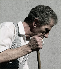
Have a look at this man’s fingers. You’ll see nicotine stains. More than that you’ll see chunks of these fingers are missing. True to form, you’ll also see him throw his head back and laugh a few frames further down on Myer’s Photostream.


You don’t always need to see the face to understand the subject of a portrait. This guy has one treasured possession. He cradles his harmonica in scarred dirty hands. A portrait specialist like Myers is able to make those hands talk.

Looking at the image, do you have a sense for the man? What sounds do you think come out of that instrument when he raises it to his lips? Perhaps more telling: what do you think HE hears when he plays? I love the sensitivity of this image.


The man in the above image weighs 90 pounds now. He has diabetes. “He used to live in Las Vegas. But a guy lit him on fire while he was sleeping. His shoes melted onto his feet and he ended up losing a toe,” writes Myers. “He likes San Diego much better.”

“I want my portraits to be so close up you can see right into their eyes or hopefully even into their soul. But sometimes you can’t be too close or you won’t be able to see their big beard or wild hair.”

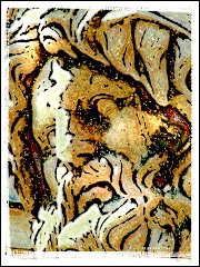
There’s no story that goes along with this one. It's my favorite shot from Myer’s Photostream. And I think that’s just as well because when I look at this face I feel a wellspring of emotion inside. I don’t know why exactly. There is a resoluteness to the face. There’s hope and a gut-level understanding of defeat. There’s intelligence and a very specific beauty as well.

“When I’m feeling depressed, sometimes I go downtown, just to talk with the homeless. For some reason, it makes me feel better,” says Myers. “They are great people and I love them.”

We know, Ted. We know.

Spend a few minutes with Ted’s friends on his flickr Photostream: http://www.flickr.com/photos/22000114@N05/

NOTE: All photos in this blog segment are by Ted Myers and are used with his permission. He reserves all rights.

Tuesday, October 7, 2008

Fabio's Fabulous Roma

I’d been in Rome about two hours and I was learning what “jet lag” truly means.

My wife and I dropped our suitcases off at the hotel, grabbed our cameras and headed out. When we get to a new city, we try to find one of those double-decker busses that take tourists around to see all the sites. We’ve found this to be a great way to get oriented and plan the places we are going back to.

On this particular morning (which was the middle of the night as far as my body was concerned) I admit that I was listing to one side. But then the bus turned a corner and I had one of the most powerful travel experiences of my life.

I was face to face with the Coliseum.

I remember the fog in my brain clearing instantly – and being completely overwhelmed. This wasn’t a Hollywood set or some tacky theme decoration. This was THE Coliseum. Gladiators fought here. Gala competitions were run here. Guys who ruled the world came here.

My memories of Rome all meld together. We’d be up and out before the sun rose. We’d walk the entire day, walk until our feet burned and then walk some more. There is such a casual beauty in Rome. Touchable history and fascinating people.

Fabio, the second flickr artist I’d like you to meet, says his Rome is something altogether different.

“Already the monuments of Rome are among the highest expressions of architectural history,” he says. “They are photographed by almost everyone. But what about the people who live here? Who sees them?”

Fabio does. He lives in Rome. He’s a barman and a web designer. He’s also one of the finest street photographers I’ve ever seen. We had a long chat the other day, talking about his passion for street photography.

“I love the portraits on the street,” he tells me. “Photographing people in their daily life, I manage to communicate the beauty and complexity of life for everyone. Most everything is spontaneous and natural. Everything is more beautiful, like life itself.”

Here’s another star of flickr that doesn’t have any difficulty communicating his passion for life, and the vibrant tableau around him.

We invited Fabio to share some of his favorite images. His absolute favorite is at the top of this blog. It’s of a woman looking to the east. When I asked him what made it his favorite, I found the nuances of what he discussed fascinating. He talked, not only about the direction the woman is looking, but also the things he chose to leave in the background: the crossed legs, the people – all the busy life going on around this very still looking woman.

When you look at Fabio’s work, you need to pay attention to the things he has included in the image. Yes. The people are fascinating but the beauty of this work to me is that they are all captured in the context of where they are in that exact second. And where they are has a tremendous impact on the overall image.

“You can stop the memories of life with an image,” he explains.


He wanted you to see this violin player as well. Have a good look at the artful cropping here. Many artists would have brought the crop in tight on the subject. Fabio chose to include the textured wall and to place the subject off to one side. What’s he saying? I think he wants us to know where this charming man comes from.

No one poses for Fabio.

“My photos are stolen,” he admits. There’s no further explanation forthcoming. Actually, when you think about it, no explanation is necessary. My sense from having talked with him is that Fabio isn’t interested in taking the same photos others do. He wants people in his images. And he wants them raw.


Does it get much more raw than a mother’s love? As you look at this image, try to reconstruct what it was like to stand there. If you were Fabio, how would you have composed the image? Here the mother is holding her child, attentive. This is a particularly eloquent image because you don’t need to see her face to know what’s happening in her heart. The child holds your attention with its eyes. It is a masterpiece of composition.


Here is an honest streetscape. The image is titled “How to Shoot a Wedding.” Here’s an alternate title: “How to Shoot a Streetscape.” Fabio’s fascination with people comes shining through in this image. The couple kissing are the subject, only because they are the focus of all the other people’s attention. Fabio doesn’t care about the kiss so much as he cares about showing us how other people react to it. Some smile. Some look away. What do you suppose the woman in the backpack is feeling? How about the couple holding hands?

A great streetscape poses questions like this and give the viewer great material for dreaming themselves into the image.


I wanted to finish with my personal favorite from Fabio’s Photostream. It’s entitled “Where the Hell is Jack Sparrow?” Again you will find the outstanding use of negative space and texture to put the subject into his environment. For me the image is all about crisp focus and that perfect instinct for the exact right time to take the shot.

Post-production isn’t a big part of the job for Fabio. “Ten minutes max,” he says. “I work on the contrast, the crop and the tone.”

At this point I am willing to bet fifty bucks that, as he typed this response to my question from his home in Rome, that he shrugged. My impression is that this is not an artist who is about working in the studio, or slaving over a hot computer.

This is a guy who is all about the street and experiencing the rich life that provides the heartbeat of one of the world’s great cities.

I love the mental image I have of Fabio creeping through the streets of Rome, camera in hand, looking for the picture that tells us a story, an image that shares what his Rome was like today.

Have a look at his flickr Photostream: http://www.flickr.com/photos/jeyh/

All Photos in this blog segment are by Fabio Jey-Heich and are used with his permission. He reserves all rights.

Monday, October 6, 2008

Tuscany MAGIC from Alessandro Ornelli


I spent a day in Tuscany. When I left, part of my heart stayed behind. We are planning a trip back to that wonderful region because a handful of hours simply wasn’t enough. Actually, I don’t think a year…a decade...or even a lifetime would be enough.

Tuscany is everything you imagined it to be and much more. The countryside is a perfect canvas for all artists. It inspired the artist, Michelangelo and birthed the incomparable singer Andrea Bocelli. It’s where you will see vineyards and history and the kind of countryside you thought could be found in storybooks.

It’s also where Alessandro Ornelli makes his art. Alessandro lives in Toscana. By day he is a PC technician but when he packs up his camera and heads out for the fabled countryside of Tuscany, he’s on his way to becoming one of the top graphic artists on flickr.

He is absolutely one of my all-time favorites.

I wanted to start this series of articles with Alessandro because the first time I saw his work, it took my breath away. I mean it. I saw an explosion of colors and light and I distinctly remember my jaw dropping as I sat in front of my computer having one of those “oh my God” moments every photographer hopes to inspire with his or her work.

It’s difficult to speak with Alessandro. His English isn’t good…and my Italian (beyond phrases like “Where is the red dog radiator banana located?” and “Please, madam, may I have three of your large green ears?”) isn’t much better.

We had to do all our talking through translators.

But look at these images and try to tell me Alessandro has a hard time making himself understood. I dare you.

“I love clouded, dramatic skies,” Alessandro writes. Okay. He didn’t have to tell us that. Both of the images he selected to be shown to you feature those huge Italian skies. Up top is one of his favorites. The Italian title translates to “Rain Threatens.”

You need to have a look at this image’s full size so click on it, spend a minute or two looking at it (and wishing you’d taken it…because I sure do) and then click on the “Back” button and meet me back here.

First, let me draw your attention to the leading line. Alessandro crops his image so those lines lead right to the sky. Open the picture again and have a look. As you look at the image, you will more than likely find your eyes following the furrow directly to that fabulous sky.

There are three beautifully ordered color grids being used here: the foreground is this awesome earthy brown. To the sides and the middle is vibrant green. The sky is comprised of varying shades of grey and black.

You need also to watch and see how this artist has used light. There’s light in the clouds as well as two lines defining the break between the brown earth and the green middle ground. See how he has used light to create that division?


Light plays and even bigger role in the second canvas Alessandro chose to show to you. This is the effect we have all seen and find very difficult to replicate. My wife and I call these “God rays” – bright lances of sunlight breaking through the clouds and shining perfectly on the earth below.

There are two really interesting things about this image to me. First: it has to be about 85% sky. The artist has decided the light and texture of his work are what he wants you to see. Where the first image started your eye at the bottom of the shot and then led you to the clouds – this image starts with your eye wandering around those wonderful dramatic clouds and then riding the rays of light down to the ground. In this image, earth is more of an afterthought…and, with a sky like this, why shouldn’t it be?

Look at the colors: strong greens and blues and whites. Bold and so very lovely.


This is my personal favorite. I chose it from Alessandro’s Photostream to share with you. I looked at this for a very long time the first time I saw it. The English translation is “The Party Ends.”

Do you see a continuation of what makes this artist truly exceptional? The sky, the perfect textures and the LIGHT – so lovely that it almost hurts your eyes. One lone umbrella remains and the people have vanished. The clouds are reflected in the water, the sand is textured with lines that lead to the water and then onto the sky. To me, this work is incomparable.

Alessandro says he spends about half an hour on each HDR image and shoots about 60% of his work in HDR. There’s a deftness, confidence and skill about his work, isn’t there?

I wonder how many Tuscany businessmen have watched him working on their PCs and had no idea who he was…or the awareness of beauty that waits within him.

Alessandro Ornelli’s flickr photostream can be found at http://www.flickr.com/photos/10235766@N08/

Pop by for a look. Who knows? You just might learn something.

I certainly did.

NOTE: All photos in this blog segment are by Alessandro Ornelli and are used with his permission. He reserves all rights.

"flickering" Thoughts

I’ve been playing around on flickr for the past while. For those who don’t know, flickr is a photo sharing website with teeming millions of photographers.

Some are scary good. I’ve seen utterly remarkable Photoshop and Photography work.

I’ve also seen some really awful stuff: snapshots of vacations, "cute pet" pics, endless wedding and family reunion photos.

(My photostream, loaded with travel and Photoshopped stuff is here: http://www.flickr.com/photos/41659872@N00/ in case you want to go there and begin writing wild notes of praise and send me blank signed checks.)

Times at my company have been really busy – which explains why I haven’t been around much. It’s not that I don’t think of you guys. But it takes me quite a while to put together a reasonable blog and time has been a real luxury lately.

But back to flickr for a second. Here are a couple of thoughts:

1) We are talking about a site that is as much about politics and networking as it is about the photos. Those who are well-connected get a TON of immediate response to their work.

What is “response?” People can “comment” on your photo. They can also choose to make your photo a “favorite.” Or they may make you a “contact” – which means they want to have constant updates on your work. The "genuine" compliments are the latter two.

My issue with this is that no one really seems to want advice. The comments are unstintingly positive. If people really wanted to hear what you think, they would say so. Read through the comments on pictures and try to find one…just ONE…that has a real suggestion for how to make the image more effective.

2) The awards are mostly meaningless. Since many flickr groups are intent on spreading their name around, there is a tremendous emphasis on giving out “awards.” As an example: some groups will demand that if you post one of your pictures, you are expected to make group “awards” to at least two other pictures. (“Awards” are codes you cut and paste from the sponsor group.)

The result, somewhat predictably, is that there are tons of awards given. This means that people aren’t really looking for “award worthy” work. They are looking for likely candidates to dump awards on. Not the same thing. Many people cut and paste awards and make no comment at all.

I think this leads to “fickr fever” – a condition where the patient is unable to sleep for fear of missing even one positive comment the very instant it arrives. The patient is constantly trying to cook up new ways to curry the favor and attention of other flickrites.

I’ve created my own award that I give to work I genuinely respect.

2) BUT there is a mind-blowing variety of material available on flickr. I’ve learned a LOT just from looking at the hundreds (maybe thousands) of photos. You see how different artists approach the same topic, how they visually depict various ideas and concepts.

You’ll see illustrations and Photoshop. You’ll see photography and snapshots, landscapes and portraits. You’ll see photographs from all around the world of interesting people doing interesting stuff.

This is probably the very best reason to check flickr out. The compact exposure to all kinds of new art and visual “muscle” is candy for anyone’s eye. There are outstanding artists on flickr.

3) It’s interesting to see what people comment on…when they do comment. A great photograph HAS to be about more than a great subject. Everyone likes to see cute kittens, pretty girls and fabulous sunsets. These images really draw tons of comments on flickr.

But often it’s a lousy photograph of a great subject that also draws comment after comment. Sure. It’s a cute kitten or a lovely girl. But often it’s a badly composed or poorly exposed image. Sometimes the images are over-processed. A great subject in a terrible photo is still a terrible photo.

I am astounded at how often the viewer chooses to overlook this stuff and “oooh” and “ahhh” about the subject instead. Reading the comments will give you a great insight on how your image might be viewed by its audience…an audience you never meet.

4) The absolute “proof in the pudding” about all things flickr is the answer to these questions: “Has being there made me a better artist? Do I think about the things I have learned from other people at flickr? Has the bar for my own work been set a little higher?”

The answer to all three questions, for me anyway, is “yes.”

So I am planning to devote the next few blogs to discussing the work of some of the exceptional artists I have found on flickr.

Stick around. It’s going to be interesting!