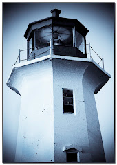
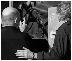
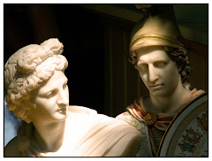
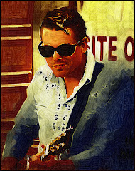
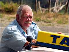
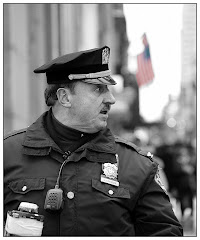
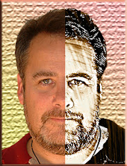
There is a powerful thing that is created when a graphic goes from color to Black and White. You see details more clearly in a B&W than you do on a color graphic.
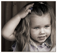
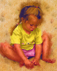
See that cute kid? I am blessed with children in my life who know how to pose. I asked her not to smile. She didn't and this is what happened.
Which picture is stronger?
I don't see a contest here. Despite the fact that the subject matter (the aforementioned cute 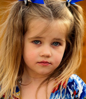 kid) is visually interesting, the job of the graphic artist is to make the visual "more gooder."
 kid) is visually interesting, the job of the graphic artist is to make the visual "more gooder."
One of the great things about Photoshop CS3 is the control we are given over the whole desaturation process. You will find this little gem under Image> Adjustments> Black and White. This will bring up a spiffy new menu that hasn't existed before.
To really understand the power of this menu, you need to do one of two things. First: open a picture that is LOADED with color. Play around with the sliders and watch the voodoo-magic-way-cool stuff that happens to your graphic as you do. The settings I used on the original are represented on Black and White graphic. But you will find that there are WAY too 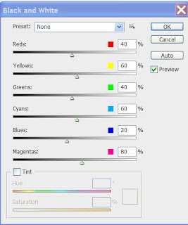 many options represented here for a wee blog.
 many options represented here for a wee blog.
The second option is, of course, to pick up our "Perfect Portraits" course from our website. It's due for release in the late summer/early fall.
Meanwhile -- take a hard look at the many many options you have at your fingertips with this wonderful little adjustment, which I happen to think is the second greatest thing about CS3. I'll tell you what the Absolute Coolest Thing is on a later blog.
Just three things you may want to keep in mind BEFORE using the B &W Adjustment menu:
1) Always ALWAYS work on a layer copy. This way if you mess it up the world, as you know it, won't end.
2) Do your other adjustments (sharpening etc.) before you start working in B&W.
3) You will often find that INCREASING THE CONTRAST before taking the whole thing to black and white can greatly enhance the finished product. Remember that the great luxury Photoshop offers is the ability to work in layers.
Finally -- you may want to consider simply desaturating PART of your graphic. I have one displayed on my NAPP site (the link's at http://www.photoshopbasics.com/ ) that is only an orange umbrella on an otherwise black and white graphic. Very easy to do -- and it can be remarkably effective.