 This house was amazing. It sits just outside the French Quarter and is definately owned by an individual. There are flags and wood carvings, inventive and wildly contrasting colors. My wife and I stood for a good two minutes or so (which is a very long time considering my limited attention span) and gawked at the house.
How do you make a good image of this kind of place?
The first thing you DON'T do is take a broad shot of the house, trying to include everything inside one picture. Sure, your viewer will get the sense that this was a really cool house, but unless you do some vast Photoshop work, that's the only impression they'll get. Let's face it: the Photoshop work you would do would result in the visual representation of one or two elements of the picture anyway.
Think of one of those Find Waldo puzzles, where you have to look for a long time at confusingly similar images to find the geek in the red and white striped shirt. You study it and finally he jumps out at you.
But if you take a second to look at the WHOLE picture, where does your eye go? It travels around, looking for something to focus on. Your brain is trying to make sense of the image, wondering what the picture us about.
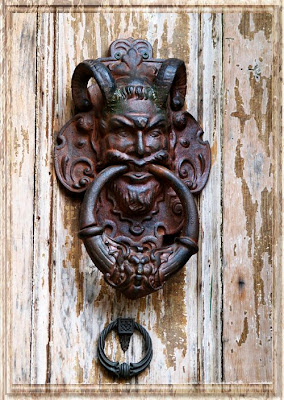
My very interesting house picture would have had the same effect. So I made an image of the doorknocker. And I broadened the focus to include this great textured door as well. It's a great effect, finished by adding a raised bevel frame using a combination of onOne's Photo Frame Pro and the Layer Style (that fx logo at the bottom of the layers menu) options to complete the effect.
The point here isn't so much the frame as it is the image inside the frame. It's an odd rectangle with an odd and beautifully textured image in the center.
Did you know that Hollywood heavyweight Nicholas Cage owns what is reputed to be the most "haunted house" in New Orleans? It's true. His house is featured on every Ghost Walk tour the city does. The tour guide tells you about a wealthy woman who lived there and tortured, starved and abused her slaves in secret. Now you can hear the ghostly clanking of chains, see strange misty people and a bunch of other stuff that sounds a lot scarier in the dark.
 Tourists lined up to get pictures of this house -- which is by anyone's account, a pretty ordinary looking house. Not an interesting image. It would be different, of course, if it were to have dramatic gables and a hunchbacked butler answering the door. But it doesn't. So I took two images from this house...each one is designed to allow me to tell the viewer the story about the hauntings. As with the Creepy Doorknocker above I focused on one or two elements.
This is an urn just inside the doorway to Nick's house. (Just try to tell me he's not playing up the whole "my house is haunted" thing...) and it was the most "obviously haunted looking thing" in the area.
Do you think this picture just might be more dramatic than a shot of a fairly ordinary New Orleans house?
The second pic I took here, by the way was of bright yellow flowers on the second floor balcony. The reasons for this, and the treatment of the picture is discussed in the upcoming "Perfect Portraits" course coming out in the fall.
If you've been following this blog, you know that my wife and I both like graveyards. The older the better. We hit the jackpot in New Orleans and Brownsville, Texas. There were some amazing pictures here.
Many postcards feature panoramic views of raised crypts. These are great -- but they don't say any one particular thing about the grave, the person in the grave, how people who have seen the grave responded -- they are just pics of generic graveyards.
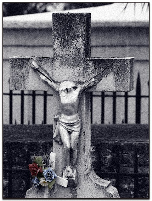
This picture was taken in a little out of the way graveyard along a back Texas highway. From here you can spit into Mexico. The grave marker surprised me. It was visually interesting. It was elegant -- even though it depicted the most horrific death possible. Someone had gone to the trouble to hack the head off. It makes for an interesting picture.
First, I reduced the picture to a high contrast black and white, using both Desaturation and Alien Skin's Exposure filter set. I had pre-selected the flowers and dropped the contrast just a little bit so that it would retain color -- but not too much.
Think for a second about how this one cross would fail to stand out in a panorama shot, and how much more effective it is when shot by itself.
The upshot of this whole blog is that shooting bits of the "whole" picture can result in some very strong graphics indeed.
I am always interested in seeing "Bits" photos, by the way. If you've got something you'd like to share send it to us. We'd love to post it and allow others to comment on it.


