Wednesday, July 23, 2008

Pictures vs Snapshots

West Edmonton Mall is just down the street from my house. In that mall they have a "life sized" replica of one of Christopher Columbus's ships. It is sponsored by Kodak.

There used to be a sign there suggesting where tourists might want to take a picture from. (Oddly, this was also sponsored by Kodak...in the dark days of film before digital became the norm.) I would watch as tourist after tourist lined up so they could stand there and snap a shot of the Big Boat.

I suspect that they each wound up with a decent picture. And it's obvious they weren't trying to make graphic art. They were just wanting to take a decent picture. They wanted to make a documentary picture that says "This is what it looked like. And I was there." This is a perfectly cool reason for taking a snapshot. If you are a tourist.

Graphic artists, on the other hand, are trying to make graphic art...which is why the job description fits so well. At our recent Capital X celebration, this booth caught my eye. While I am not entirely sure what Frozen Dessert actually is, I thought the very best way to present it was to use the lines in both of the ice cream cones and the lettering to point up to the dramatic sky. For this graphic I was not caring so much that the picture itself be a documentary as I was in showing the towering cone reaching for the sky. It is an absurd concept, huh?

Tweety, on the other hand had been abandoned somewhere on the midway. I suspect someone spent $4,000 trying to win it. Tweety abandoned wasn't a particularly interesting picture. When my wife put Tweety (I've never been sure if Tweety is a boy or a girl, by the way) on a garbage can with a Navy sticker the colors, textures and contrast really popped.

I played around with putting crosshairs in the middle of Tweety's forehead, but in the end I decided to leave it the way it was.

The last fair picture is a good example of trying to take a picture of a PART of something to give a sense of the overall thing. This ride was in Kidsworld and had a wonderful rusty look to it. Colors and glass, textures and life just crackled from it as a subject.


As a straight graphic, it didn't work. So I made a selection of a border within the picture (using the Rectangular Marquee Tool and then going to Select > Inverse). The I took the Dodge tool (found in the toolbox) and set the Exposure to about 50% and very gently darkened the border.

You'll see that the dead center of the flower places in the upper right Dynamic Point in the Rule of Thirds. That is what makes the picture work.

Here are Three Great Rules For Taking A Picture That Isn't The Same As Everyone Else Is Taking And Maybe Even Getting Graphic Art Out Of It (TGRFTAPTITSAEEITAMEGGAOOI for short):

1) Try a different angle. If everyone else is taking a straight on shot of a Ferris Wheel, try standing under it and shooting upward. Try standing across from it and the angles that way. Get above it if you can. You'll be surprised at what you see.

2) Take LOTS of pictures. It's digital. Relax. What doesn't work you can delete, right? So snap away like crazy and then delete like crazy when you see how they turned out. You need to expect that most of the pictures are going to suck. That's okay. Cause one of them won't...

3) Crop like a Crazy Person. Remember that "Undo" is a wonderful command. I use it a lot. Really. Don't be afraid to skew the picture wildly to one side, or crop out a panel...or break the whole picture into panels. You'll start seeing things in the shot you never knew were there. That's where the art comes from.

Don't stand where everyone else is standing. Go the other way. Take chances with your shots. Try different exposure compensations, try different shutter speeds. Try different Scene Modes. Try lots of stuff.

Eventually you will keep doing stuff until it's no longer stuff -- but becomes Stuff You KNOW. And that kind of stuff results in great Graphic Art.

Photographing Brent Butt

I don't like Canadian TV.

Frankly it's been a little embarassing. The height of our cultural "televisionary" experience in my childhood was The Beachcombers -- which looked, to me, like a bunch really bad actors who lucked out during "Canadian Content" madness imposed/inflicted by the CRTC.

American game shows give away trips and cars. Canadian game shows give away toasters.

So when my wife and I spent the day at Capital X and learned that Brent Butt, the star and creator of "Corner Gas" was the featured entertainer, I wasn't all that keen to see him.

He turned out to be polished, charming and intelligent -- which made me wonder how he ever got onto Canadian television. Midway through his show I decided to try to photograph him.

It was a challenge: the stage was bathed in a sickly blue light. The sun was going down and there were several hundred people milling around in front of the stage. Butt moves a lot during his show, paces back and forth, gestures wildly, talks to the audience and the security guards. I had my ISO cranked to 800 and I needed my telephoto to get any kind of decent picture. (Telephoto lenses cut out a lot of the light you really need at that time of night, by the way. Think of looking through a paper towel roll. That's what a telephoto does.)

I shot maybe thirty pics of Butt (and yes, the name still makes me laugh) and, along with the predictable grain and occasionally blurred focus, I realized that the pictures didn't come close to capturing the energy this guy was expending.

I'm always conscious of trying to convey how it felt to stand there. How do you convey a performer's energy?

For the graphic above, I chose to use Photoshop's outstanding B&W adjustment (Image>Adjustments>Black and White) option. I really believe this is one of the best things about CS3 since you can now manipulate the individual colors. The blue light started working for me. It produced a very pleasing "glow" on his shirt and his head. I used my dodge tool to darken some of the "way too bright" areas and then created an Curves Adjustment Layer. I wanted the picture to convey energy as well. I skewed it slightly to the left in the crop so it's off balance...just enough to look interesting to the eye.


Butt was a great subject. He mugged a lot for the audience, held interesting objects (hats, Spiderman hammers, etc) and had an amazingly expressive face. I had a good time photographing him.

Stage performers are usually good subjects because they are...well...performing. This makes for some great expressions and wonderful postures. You need to be really conscious of clutter like microphones and backstage distractions. Shooting from a crowd under less than ideal lighting can make for some very tough conditions and Histograms that will make you wince. Just remember these three quickie options for "Improving Crappy Stage Performer Photos":
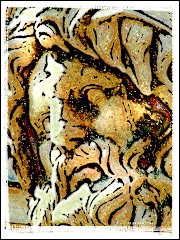
1) Got Grain in your image? You've got two options. You can use Photoshop to remove it (which isn't always the best option) or you can actually ADD grain. That's what I did on the top photo. Adding grain can give you a wonderful gritty effect.

2) Crop well, grasshopper. If you don't know about the Rule of Thirds (which is yet another spiffy entry on this blog) you need to learn it. The RoT is one of the best guides ever for removing junk in your image and honing in on what the picture is really about. Sometimes what the pic is really about will actually surprise you.

3) Remove distractions. All of them. If it doesn't add to the image and what the image is ABOUT, cut it out. Use the clone tool or the Healing Brush but get rid of it. In the Spidey Hammer picture, there were lots of silver poles behind my subject. I removed nearly all of them easily. What's a distraction? Pay attention to where your eyes go as you first look at the photo. Do they go to your subject or do they drift around looking at a bunch of "stuff?" Dump the "stuff."

I found the fair to be a wonderful place for shooting photos. More about that in a later blog. Right now my wife and I are getting ready for a trip that starts in Vegas and then meanders down to Route 66 and Arizona. We understand there are wonderful pictures along this partially deserted highway.

Want to come along?

Friday, July 18, 2008

Golden Hour

Have you heard photographers use the term "Golden Hour?" I first heard it on a perfect afternoon in Nova Scotia in one of the world's most photographed places: Peggy's Cove.

My wife, the true photographer in the family, started planning where she was going to be during "golden hour" -- and, since I assumed this meant some event at a bar, I was completely on board.

When I asked her about it, she first laid one of those "are you kidding me?" looks on me and then explained that golden hour was that perfect time when the sun is just going down and a wonderful light bathes the world with soft, magical color. So we planned where we were going to rush to when Golden Hour actually happened.

While my pictures that day were nothing spectacular, I tried manfully to grasp the concept. Understanding only came when I finally agreed with myself that I could never explain the effect (and truth be told, I don't want to since something truly magical should never be explained) and simply accept that it happens...and try to position myself near something cool when it does.

The eagle statue in this blog was taken at the perfect time in Golden Hour. Other than cropping, there's no Photoshop work at all. This is the picture of an otherwise mostly uninteresting grey statue in Philadelphia. It sits at the entrance to a bridge near the Amtrak station. When we passed by it in the morning, it looked mostly uninteresting and grey. But when we returned as the sun was going down even my throbbing feet could not prevent me from wanting to stop and take some photographs.

You'll want to look very carefully at your subject during Golden Hour. If the object of your attention is moveable (you can get some wonderful portraits at this time) you'll want to move them so you get maximum light on their face. You'll be astounded at how the perfect lighting breathes magic into your subject.

What IS golden hour light? I really couldn't tell you. I have no idea how it would be replicated in a studio. And, having given it careful consideration for at least two and one half full minutes, I am convinced that the perfect lighting of Golden Hour is one thing that cannot be easily replicated in Photoshop...if it can be done at all. How would you get the great soft light and the perfect shadows without hours and hours on the screen with Photoshop? Better to just relax and take your pictures during this magical time.

I read a book once (okay...more than one book) where the advice to the 'serious' photographer was to spend an entire day around your subject. It advised that you watch carefully how the light changes and how the shadows move to create a completely new "look" to your subject. It's something I plan to do...one day. But until then I will just wait for Golden Hour light to fall on a beautiful thing and make it even more beautiful.

But there's no question: Golden Hour is God's gift to photographers.

Wednesday, July 16, 2008

Little Pictures in Big Places


Places don't come any bigger than New York City. There's something wonderful around every corner. There are the biggies: the Statue of Liberty, the Empire State Building -- Broadway.
You're expected to take pics of those. I'd think you had some wasting brain disease if you didn't. But I've done all those. Now when I go there, I am looking for the "little pictures."
The great "Little Pictures" are like fairies -- because you usually see them out of the corner of your eye and if you don't look again, they're gone with a tiny change of angle or a subtle shift of light.
If you've been anywhere near NYC, you know "The Dark Knight" is being advertised everywhere. I find the photo of Heath Ledger particularly spooky because it's a creepy pic. But more than that, it's a creepy pic of a dead guy which makes it even spookier.
This is my first "Little Picture." What's more New York than a subway station? What could make a picture of the fabled cartoon character, the Joker, more interesting than to turn everything around it into a comic book and leave the picture of the cartoon character as a picture? Have a good look at it. (Click on the photo and you can see it "big.") It's not hard to turn the real world into a comic book. I did some blurring and ghosting of the image and then I used Snap Art -- the Alien Skin plug in to complete the picture.

Speaking of Gotham City, how about the bird head? He (she maybe?) is a minor detail on a fountain. The effect of this little picture required no Photoshop work a all -- other than the light border. I wanted the creature to be glaring at something we couldn't see. I wanted the texture of the stone and the cracks to be part of it. I used a Macro scene adjustment with a flash so that the whole background blurred and we are left looking along the same line as the stone bird.
I can't take credit for the last "Little Picture" I want to share in this blog. We're all familiar with the 9/11 tragedy. My wife and I try to get by the site of the reconstruction as often as we can. She spotted this little fire hydrant on the other side of the fence and began photographing it furiously. I had no idea what it was that had captured her attention until I took the time to look.
This "Little Picture" is about a lot of things. It's about the texture on the fireplug and the solid feel it has. It's about the little sticker that someone went to a lot of trouble to put onto it...and it's about wondering about that certain someone and why they chose the words they chose and why they chose to put them onto a sticker...and if they actually intended to use them on the WTC site from the beginning...and why.
I really like this one. It was very hard to get because it required a macro and a flash to do properly. I used Photoshop fairly extensively to bring up the lettering on the tag and to build more contrast into the fire plug.
But on the scale of Cool Little Pictures, it ranks at least a 9 for me. It would have been possible to do more work on it. But I wanted the lower portion of the fireplug to ease off into darkness with light falling on the top and the wee label.
Seeing the Little Picture isn't always easy. Sometimes it's a flag hanging from a lamp. Sometimes it's a person crossing the street. But good "Little Pictures" tell a story. Or they ask a question. Or they make a point. In a dynamite graphic -- they do all three.

Monday, July 14, 2008

Okay...It's Time to FLASH the World!


This IS a blog about Photoshop and Photography. It's going to stay that way. But I wanted to let you all know why I may occasionally break down into sudden fits of Inarticulate Sounds of Complete Suffering.
I am told that the world is using FLASH. And it's time for me to set aside significant misgivings and actually learn this Adobe program.
Most of my professional life has been spent avoiding anything to do with coding or the mega-geek stuff that makes this old brain ache at the very notion of yet another learning curve.
You may or may not know that I am (in addition making a chunk of my income working with Photoshop and PowerPoint) a professional magician. I work with corporations doing trade shows and I do stage shows for kids. I like it all.
My first coding avoidance technique had be the design my website (http://theseriouslyfunnymagicguy.com/) which I took from a Dreamweaver template (for a SPA!) and created with great fear and trembling.
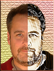
But more and more clients are demanding Flash in addition to Photoshop and PowerPoint. I created my own logo (the guy in the upper left corner) from a picture my wife took of me one evening in Rome. I decided against anything showy and decided to go with the photo and a plain text.
I've designed a few logos in my time (which pre-dates the dinosaurs) and, while clients often want something really flashy, the intent of a logo is to communicate an idea clearly.
Have you noticed that I am even avoiding dealing with Flash in this blog?
**sigh**
So the other day I took the plunge, spent money on Adobe Flash CS3, downloaded a couple of courses and got a library book on Flash CS3 (I used to buy TONS of books but noticed that I read them once and pretty much forgot about them) and started learning.
**sigh**
You know what I felt when I looked at the Flash desktop for the first time? It was very similar to the feeling I had when I looked at Photoshop for the first time. Only the toolbar was familiar. But there were TONS of things I didn't recognize. It was sort of like being in a country where you sort of speak the language -- but not really. It was an "Oh my God" moment. So I have an acute sympathy for those of you approaching Photoshop for the first time.
So here I go. Don't worry. I won't file endless updates on the learning of a new program. But I might mention it now and then. It will most likely be an inarticulate sound of human suffering as my brain stretches into uncomfortable horizons.
I understand that the above logo (developed in Photoshop of course) can be made to do some very cool things once I understand Flash. So that's what I am going to do.
Prepare to be Flashed, World.
Eventually.

Friday, July 11, 2008

What did it FEEL like to be there?

I am standing in the French Quarter on a hot summer afternoon. There are puffy blue clouds in the sky and not a hint of rain. I can smell good food coming from the open (and very inviting) door to a restaurant. I can hear hot jazz coming from a bar down the street. There's a lazy, contented feel to my world. It's full of things I could do and places I could go. But at this exact second, I am content to stand there and let NOLA seep into my spirit.

How do you summarize what a moment felt like in a single image? It's impossible. Take New Orleans, for example. The city is still recovering from Katrina -- but the jazz is hot, the food is good and the people are smiling. It's a place that never settles into sleep. There's always something going on. There's always somewhere wonderful to go. You can tour the devastated outskirts of the Big Easy or hang out on Frenchman Street -- where the locals go to avoid all the nasty business that goes on at Bourbon Street.

There's just so much life rising out of the ashes. There's magic on the streets, in the music and the food. It really feels like New Orleans, as an entity, accepted the devastation from Katrina, shrugged, smiled and picked up a trumpet to lay down some great jazz.

So my plan was to try to convey that feeling to you with this image.

This isn't a blog about technique. (On the off chance you care: The graphic is a composite of two photos. The primary photo is a statue of Al Hirt -- the New Orleans trumpet virtuoso. The glow comes from a deliberately ragged extraction, inner glow and drop shadow from the Layer Style menu and a touch of white corona from Alien Skin. The cemetary shot has been changed into a "painterly" effect with the Artistic Tools as well as Virtual Painter.)

This blog is about relaxing and BEING where you're going so you can convey that feeling to others via your graphic design.

If you find yourself in a new city and are intent only on getting where you are going you're going to miss what it really feels like to be somewhere exotic. Let's face it: most tourist places look the same.

But how does the place feel?

On each trip, let me urge you to take a few minutes to just stand or sit. Let me urge you to let the cells of your spirit open up and enter into the stream of where you are. On the heels of that potentially deadly artsy observation, let me make a few suggestions for how to construct a graphic that "says it all."

1) Make Notes. My wife excels at this. She'll plop herself down on a sidewalk, grab a pen and start writing. I have really tried this -- but it doesn't work for me very well since I am pretty old and have a tendency to put stuff down and forget about it. But in any case, as you sit and start your project, keep all those sensory things in the front of your mind. It will help you stay on track.

2) Start Designing your Graphic as you Take the Picture. I will often have a rough idea in mind for how I am going to Photoshop the photograph. Sometimes I will already have a project in mind before I get on the airplane. This makes things much easier since I am actively looking for things that will fit the project I have in mind.

3) Don't be afraid to Ignore Point #2. If you are sitting down with your images, don't be so married to your original design that you ignore options that will make your design stronger. We've all had "happy accidents" which occur as you format the design. Push things around on the screen. Relax. The "Undo" command is a much better invention than sliced bread.

As you start work try to remember how your image smells. Is there food cooking? Flowers? Is the the scent of hot sun on asphalt? Try to remember the sounds: music, conversation, laughter. Try to imprint every possible thing on your memory and you will find designing a graphic much easier.

I am guilty of rushing from place to destination and not seeing much except the street signs. But every so often I manage to slow down. After all...it's not so much about the destination as it is about the journey, right?

Building Atmosphere into a Travel Picture

Jimmy Durante, that great philosopher, once said "When you know, you know."

If you've ever pressed the shutter button and absolutely known exactly what you are going to do with a photo, you understand what he meant. In each one of the pictures in this blog I knew exactly what I was going to do with them...which is unusual for me since my usual graphic design system is to push things around on the screen until they pretty much look okay.

Part of the graphic artist's job is to create images that tell a story or create a sense of atmosphere. There are a lot of ways to do that.

The image here, a man walking on the beach in Coney Island in NYC, is still one of my favorites. It really shouldn't be -- partially because it breaks a lot of rules. He's not exactly on a dynamic point in the Rule of Thirds. Neither is the gull. But there's something about this image that really speaks to me. It whispers things about solitude and reflection. It's got some of the all time great symbols: a man, small against a vast ocean, a cane, a bird. This is one of those images I can look at for a long time.

There are several things to consider in creating a graphic:

1) Is this a picture better suited to black and white? B&W is a great medium, enjoying a powerful renaissance with the advent of great digital editing tools like Alien Skin's Exposure and Photoshop. If you want a picture to look lonely -- and go directly to the heart, consider Black and White.

2) Would a PASTEL treatment be better? This is easier to do than you might think. Start by making a copy of your main photo (on the PC it's Control J) and work on the copy. Make the copy black and white or use one of the wonderful tools under Image> Adjustments. You might be able to get away with something as basic as "Photo Filter."

Once you have a treatment you like on your copied layer, go to the OPACITY setting on your copied layer and play around with the percentage. You will see the background layer bleeding through and giving you a very pleasing muted color. That's what I did with the Staten Island lifeguard picture here. You'll see some color seeping in on the bottom. If the picture was of higher resolution, you'd also see tinges of color in the umbrella. I added grain to this photo as well to make it more powerful. I used Exposure from Alien Skin to create the grain texture.


3) Think hard about every element in your graphic. It's very simple to take elements out with the Clone tool. You don't want any distractions: you just want to see the main elements. Distractions weaken the impact of your visual -- and can throw off the balance. If it doesn't fit -- cut it out.

4) Maybe it needs to be a painting? This actor played Ben Franklin. It was a very crisp photograph that was going nowhere fast. Ben just didn't look right in a photo, so I used a number of the Artistic Brush treatments, added a Canvas Texture -- and finished the whole thing off by using my Virtual Painter plug-in (http://www.virtualpainter5.com/) to complete the effect. I use VP a LOT. For my money (and I am very protective of my money) it's the best digital art plug in out there. You can get a fully functioning free trial.

5) Crop Cleverly! A lot of people zip right past the crop. I can't for the life of me figure out why. Good cropping is critical for an image that works. You must consider all the distractions that detract from the power of the image. You need to really consider the Rule of Thirds. If you pay the proper amount of attention to the crop, you will reach that "AHA!" moment when you know the picture is perfect.

Because as Durante said: "When you know, you know."