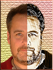
 Sync Magazine named Gary Gygax the #1 Nerd of All Time. He's the guy in the Hawaiian shirt to the left. (Pic courtesy of Wikipedia.)
 I spent one night a week with Gary for nearly six years. But I never met him in person.
He had a profound impact on my life – even though I only spoke to him once.
So who is Gary Gygax…and what does he have to do with a blog that covers Photoshop and photography? Hang in there for a second.
Gary Gygax was the creator of a game called Dungeons and Dragons. His plan was to design a new kind of game – a game where people could experience an adventure together.
He wanted to know what it would feel like to creep into a dragon’s den or experience the heady excitement of being part of a fellowship, embarking on an epic quest.
So what does Gary Gygax have to do with Photoshop and photography? Plenty.
Think back to a picture you saw in a magazine or in a book that really held your interest. I’m not talking about a pretty sunset or an ocean landscape. I am talking about a picture that you looked at for a while because it struck a powerful chord in you.
This isn’t the kind of picture you just look at. It’s the kind of image you examine. The visuals on the page reach out to you, take you gently by your spirit and help you to experience what the photographer or Photoshop artist was feeling at that moment.
For me one of those pictures was a portrait I saw once of rock and roll legend, Janis Joplin. It’s the work of another photographer, so I can’t post it here. But the image had Janis smiling shyly at the camera. She was wearing a big floppy hat and a flower necklace and nothing else. But there was an expression on her face that was quite unlike the brash rocker I knew. The photographer chose to present his image in B&W and that made for an even more dynamic visual.
Okay, okay, you’re saying. But what does that have to do with Gary Gygax? And what does Gary Gygax have to do with Photoshop and Janis Joplin’s portrait?
Gygax wanted to create an experience. When others were designing games with winners and losers, he wanted to re-think everything and re-design it to give his audience the gift of an experience.
Joplin’s photographer wanted to do the same thing with his portrait. He wanted us to know a little more about the singer – but more than that, he wanted to share HIS experience of being with her. He didn’t see the Southern Comfort swilling blues/rocker. He saw a shy girl with flowers and a silly hat.
What stands out in your mind about the image you’ve seen? What makes it strike a chord in you?
Now to the purpose of this WHOLE entry: What pictures have YOU taken that have that kind of power, and will let you communicate your feelings to an audience of people who have never met you…or been to the places you’ve been….or talked with the people you have photographed?
You need to look at a photo and decide what aspects of it will speak to these strangers. Take a look at this list of the Big Three:
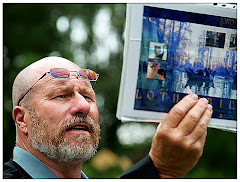
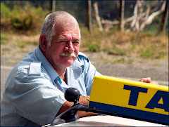
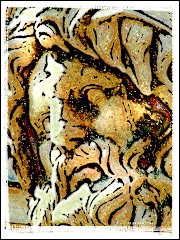
1) Does the subject define an archetype? Consider a close-up of a Wise Old Man, A Hard Working Farmer or An Adventurous Woman. Your subject needs to speak to people you don’t know in a language they will understand. If the face alone doesn’t do it – consider putting your subject into an interesting environment doing something that defines them. They are called archetypes because they have elements to them that all people can relate to on some level. The entire purpose of shared photography is to provide a visual people can relate to. Archetypes are great – because they take you half way there.
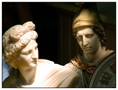
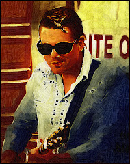
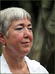
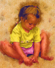
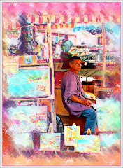
2) Does the image project two things that don’t fit together? Think about a street person in expensive clothing. How about an entire city fit inside a bottle...and floating through space? Consider a photo of a street performer which has been rendered into a drawing with a turn of the century flavor to it. The mind goes right away to visual juxtapositions because it tries to make sense of things that don’t fit. When this happens you have the complete attention of your audience.
3) Can you verbally summarize the point a picture makes in one sentence? We’ve all seen pictures of wide eyed children suffering terribly in Africa. You can see the pleading in their eyes. The message is clear “Help me, please.” It’s powerful…but it’s also an image that has been overused. How about taking that same image – and Photoshopping the image of the child into an image of a sumptuous Las Vegas buffet or casino? What would that picture say then?
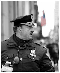
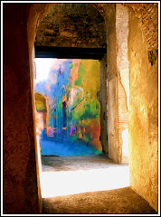
Think about the presentation of your graphic: should it be in hyper-colors or Black and White? Would grain make the image stronger or does the focus need to be razor sharp?
Gygax taught me that it was okay to disregard the rules of a game and do away with the whole winner loser thing because the whole exercise is about creating a powerful EXPERIENCE.
When you are attempting to create a great graphic – do the same. Forget the rules. Use every tool at your disposal to create a visual that grabs your viewer by the spirit and makes them a part of the experience.
And give a thought once in a while to the Number One Nerd of all time.
















No comments:
Post a Comment