The second phase of LR is accessed through the menu in the upper right hand corner of the screen: DEVELOP. This was intially designed as a pre-Photoshop area. The idea was that you would do all the prep work here: the cropping, the sharpening, minor corrections etc. using what is really a very extensive menu.Thursday, February 21, 2008
To Lightroom or Not to Lightroom...???
The second phase of LR is accessed through the menu in the upper right hand corner of the screen: DEVELOP. This was intially designed as a pre-Photoshop area. The idea was that you would do all the prep work here: the cropping, the sharpening, minor corrections etc. using what is really a very extensive menu.Monday, February 11, 2008
Why Use Black and White?
Flashback: It's the late 1970's. I am in college, in a darkroom, busy as I prep a project in my photojournalism class. I remember the smell of the chemicals, the tempermental enlargers...and the sensation.The sensation is that prickling feeling on your neck as you watch a really good picture slowly appear on photography paper. It's a portrait of a friend of mine. I see highlights in her hair -- a perfect catchlight in her eyes and that gentle grey light playing across her face. It's a great picture. I sigh with satisfaction and pride.
Our photography instructor, an ancient man who smells of tobacco and spits when he talks, comes up behind me. I step aside so he can admire my photographic harvest. He peers at the picture, which is now in the stop bath. He looks at me. He looks back at the picture.
"Got lucky, huh, Thiel?" he growls finally.
Yup. I did. But still -- it's a great picture. It's really good. I have a clear mental image of it still, even though the pic and the friend have slid far out of my life.
There remains something nearly mystical about a well done b&w photo. There's a singularity of vision -- a simplicity that can make your point with dynamic power.
And you no longer need a darkroom to do it. If you own Photoshop CS3, it's as simple as going to Image> Adjustments> Black and White. This adjustment is nearly perfect in CS3. If you are working with an earlier version of Photoshop OR Photoshop Elements, try Image> Adjustments> Hue/Saturation.
If you're ancient like me and still remember how the paper you chose to print affected the final visual, you owe it to yourself to check out http://www.alienskin.com/. This company has issued a filter set called "Exposure" that will create some utterly amazing black and white conversions.
But let's talk about two things that make Photoshop an ideal vehicle for this process:
- Your ability to select certain portions of the photograph
- Your ability to decide what percentage (the opacity) of the effect is done.
At the top of this article is a graphic called "Roxy." It's an old theater I saw somewhere in Montana. The pic was taken on a grey day and needed intensive work to punch up the contrast. I also removed the background and inserted a nasty looking sky. To send the graphic over the top, I added a lightning bolt. Finally I selected the sign ONLY and used Inverse (Select > Inverse) so that I could draw MOST of the color out of the rest of the photo.
It's interesting visually -- because it presents an impossible picture. A tired color set against a black and white backdrop.

Don't confine yourself to simply using Black and White. There are a number of very pleasing effects you can get by working with the Adjustments menu -- and if you want to take Alien Skin's Exposure out for a free 30 day test drive -- you'll find even more things you can do. Blues....greys....even greens can breathe fresh life into a tired picture.
This is a big topic. It occupies a significant section in our upcoming "Perfect Portraits" manual, which will soon be available at http://www.photoshopbasics.com/ . (Hint, hint.)
Sunday, February 10, 2008
The BEST Photograph Advice Anywhere

Tuesday, January 29, 2008
Photographing & Photoshopping Statues
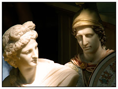
I LOVE photographing statues. They don't move. They don't care about the weather. They just sit/stand/lie there and provide TONS of options for a photographer who is open to looking at them in a new light.An artist has taken his/her time to create a complete sculpture. Capturing the whole statue is impossible. So you need to look at a statue -- or parts of the statue that effect you.
This is a statue in Vancouver. It's out front of a brick building. When I first saw it, I had to catch my breath. There was something about the tender way the angel is holding the fallen soldier -- and his complete helplessness. The image was powerful to me -- and so I wanted the image I created to be as powerful.
Obviously the brick background had to go. Then I went to work on the background. First I built a planet in the upper right hand corner using Lunar Cell from Flaming Pear. I added some upward motion inside Photoshop. And I wanted to add light, which I splashed across the front using Knoll's Light Factory. I'd cropped the picture so that the heads are in the dynamic points and that there's a smooth line of sight from her face, to his to the light.
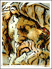
Without a little abstract thinking, statue photos can be really dry and borning. Take a hard look at PARTS of the statue that make your point. Case in point: a very impressive statue of a warrior in the Vatican. You'll NEVER catch the spirit breathed into the creation by the artist. But you CAN focus on one part of the statue that communicates an idea to your audience.

You don't need to see the rest of the statue to know what it's about, right? You can see the strength in the hand and you can see that the worn sword has been used. I like this picture better than the image of the whole statue...when you take a bite sized portion, it makes for an image meant to be contemplated. Think of it as an appetizer and not the steak.
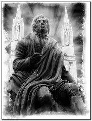
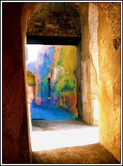
I've posted some other statue pics to the right. I try to use light...and Photoshop...to create a stronger image.
Here are THREE GREAT TIPS for photographing statues:
1) TAKE TIME TO STUDY THE STATUE. Look at it from many angles. Take long looks at portions of the statue...the hands...the head...the things they may be holding. If you take a few minutes to study it will pay off.
2) HOW DOES THE STATUE MAKE YOU FEEL? I felt something very significant looking at the angel/soldier statue. The feeling it gives you allows you to compose your artwork more precisely. Use light...background (context)...and Photoshop to make your point clearly.
3) TRY TO SEE THE STATUE MORE THAN ONCE. Try it in the afternoon...early evening...dawn. You'll see different light. You'll notice things about it you never saw before. Don't be afraid to get down on the ground and look up. Different angles and different times of day are critical to making a great image.
Finally remember that the term "statue" can be anything: a window display, a mannequin...any visual that doesn't move.
Monday, January 28, 2008
Travel Portraits
Most of us have seen those corporate portraits: the confident man sitting with a half smile on his face and a "your money will be in good hands with ME" look in his face.
That's not a portait. It's a sales tool -- and it's very successful on that level. It's a picture designed to inspire confidence in a person.
In short...it's a portait with a PURPOSE. All portraits should have a purpose...a reason to exist. A portait is an artistic impression of what someone (or something) is all about. It's a subjective image where the image-maker says "Here's something I wanted to share with you about a person I met."
Travel portraits, in particular, are tough to do. Your subject isn't in a controlled studio setting and they aren't going to pose for you. You have the time it takes for the shutter to click to complete your basic graphic. It's a split second impression that you, as the artist, have designed to make a point.
It's not a picture of Aunt Sadie smiling into the camera...or Uncle Joe making a show of sticking his finger up his nose. What interesting information do those pictures tell a stranger about Aunt Sadie or Uncle Joe?
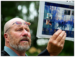
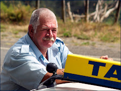
We were in New Zealand, my wife and I. And we took a full day to visit Lord of the Rings film sites. The fellow leading the tour is pictured to the right. He was a performer in the film -- and is passionate about his subject matter.
We were impressed with how much he knew about the films, where they were shot and what was going on behind the scene. He'd put a lot of time into planning what to share and how to share it.
Taking a picture of him in a studio setting with his hands folded neatly on his lap would tell you nothing about him, right?
Try to get your travel subjects inside their CONTEXT. By "context" I mean "in a place that says something significant about them" or "as they do something significant."
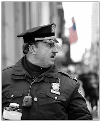
In this picture, he was reading a passage from Tolkien's book to an enraptured audience. You see intensity on his face -- the focus for my portrait. The page with the passage on the back of it is visible -- but isn't in focus since it's not the main idea of the picture. He is. His passion is. He's a guy in context.
Photoshop makes it easy. I sharpened the focus using the "smart sharpen" filter option in Photoshop CS3, did a minor re-crop and threw a "snapshot" like frame on it.
Here's a guy sharing his passion. See his face? See the way he's holding the graphic? See how he cared enough about the graphic to put it in a page protector? See how he's pushed his glasses up -- like they were in the way. Looking at this portrait...how many things could a stranger tell me about who this man is in his heart of hearts?
Try this exercise with one of your travel portraits. Pretend you know nothing about the subject at all. Try to figure out how the visual details you, as the artist, have put into the photo relate information about your subject.
Here are Five Golden Tips for making good Travel Portraits:
1) SHOOT LOTS OF PICTURES. Who cares if 95% of your shots stink? That one that is perfectly framed and beautifully exposed COMPLETES the task. Delete the bad ones and show off the good one. It's digital. Relax.
2) TRY TO INCORPORATE ACTION. Pictures where someone is doing something are much more interesting than ones where they aren't.
3) DON'T GET YOUR SUBJECT TO POSE. These pictures nearly always suck. It's so much better to catch your subject when they aren't smiling into the camera.
4) TRY TO GET AN INTERESTING BACKDROP. Where is the subject standing? Is it an interesting place? Are there interesting colors? It's all part of context.
5) DON'T BE A PHOTOGRAPHER WEENIE. These are the smug types that sneak up on a subject and "steal" a picture. This isn't cool. Try to stick to photographs (the ones with recognizable faces in them anyway) of people doing something in a public setting: street entertainers and the like. And never EVER photograph a child you don't know. This can (and should) get you beaten up in today's society.
The role of Photoshop broadens the idea of HOW to present a portrait.
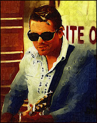
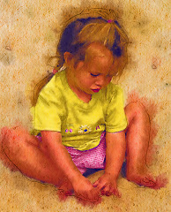
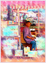
We happened across some guys playing great music in a farmer's market in NZ. As opposed to simply showing a snapshot of each guy, I used Photoshop and a third party plug in called Virtual Painter to create graphics that would be more interesting to look at. The harmonica guy was real serious and airy. The bass guy was having a great time and the guitar player really looked like he was living a dream to me. So I chose three different applications.
Is there a better way to share your travels than to share an impression of the people you have met in your travels?
There's a chapter on the thoughts that go into travel portratits in the new "Perfect Portraits" book to be released soon at www.photoshopbasics.com
Saturday, January 26, 2008
Using Photoshop For Your Travel Pics
From an artistic perspective, using Photoshop on travel pics isn't just a question of removing red-eye and pumping up the contrast. It's about trying to capture what if FELT like to be standing there...or to take a photograph that shows a fresh "take" on what otherwise would just be a snapshot.
My wife and I are huge Lord of the Rings fans. Actually we were into the series long before the movies came out. So when we went to Australia and New Zealand, one of the highlights of the trip was seeing places where the Lord of the Rings movies were shot.
Even fans of the movies may not recognize the white bridge in the picture. It's just a white bridge. But this particular bridge was the scene of some very significant scenes in the movies.
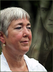
I took a picture of the bridge -- like everyone else, dutifully standing there snappinc pictures. But how do you show what the site was actually all about? The solution? I scanned and re-worked a picture of one of the LOTR characters and hid it inside the bottom left hand part of the picture. (NOTE: Doing it this way means I am using a picture I didn't take...so it's purely a graphic for my own use. But Cate Blanchette wasn't available for a sitting...)
If you're using Photoshop, the trick to getting the picture right is the DESATURATE the picture so that you get nicely contrasted lines. I then put the picture through Virtual Painter until I got a result I liked -- and then I blended the layers together to get the result I wanted. Finally -- in putting the final graphic together, I lightened the opacity to about 50% and used the often-overlooked "Overlay" Blending option. I finished the graphic with a simple green border.
Thursday, December 6, 2007
Only the (Photoshop) Basics.
Several reasons -- first and foremost is the fact that, in addition to running http://www.photoshopbasics.com/ with very high hopes for the future, I also run a special events company and perform as a magician. SO when you factor Christmas into the mix, you wind up with time for eat, sleep and work.
Second is the notion that I just might be talking to myself. It's true that my web jedi partner and I intend to build PhotoshopBasics into as much as humanly possible. It really is amazing software and it SHOULD be in the hands of more people. But I have no real concept how to get people to this particular blog, to know if anyone is actually reading it, or if it will get people to the actual site where I hope to make a living which is http://www.photoshopbasics.com/ .
I know that someone looking at Photoshop for the first time is likely to react the same way I did. I nearly threw up. There I sat in front of my computer with no freaking idea what was what. Everything looked unfamiliar and there were SO many options that I had no idea where to start.
So I did what a lot of people have done: I tried to learn from the piles and piles of "free" tutorials on line. This isn't a course of action I recommend. Some of them give you little gems of knowledge. Others give you wrong information and still others add you to nasty little mailing lists and you get endless emails from people who think there are various aspects of your body that need immediate improvement.
You can get a book, of course. I did. I buy a LOT of books. They come in two varieties: the COMPLETE EVERYTHING YOU WANT TO KNOW ABOUT PHOTOSHOP AND A LOT MORE. These books are great if you are patient and able to absorb HUGE amounts of information. (MOST of it is stuff you don't need to know.)
The other variety of book is what I call "fairy dust" stuff. This kind of book touches on specific projects you can do. Along the way you learn how to do some very cool stuff. But you don't learn ALL the basics.
I just wanted a course that would assume I was a reasonably intelligent person. I wanted a course that would show me the basics: where the Important Stuff was and What The Important Stuff Did. I needed to know how Layers work and how to select stuff -- and how to change stuff. Once I have that under my belt -- then I can learn new "stuff" as it comes up.
This course didn't exist. OR if it did, I couldn't find it.
So I wrote one. This course has full screen "videos" that go step by step through the ins and outs of the Photoshop workings. AND I created some interesting projects that would make learning fun.
I'm not under the illusion that I am going to get rich from Photoshop Basics...or even that I am going to make a lucrative living from it. BUT I DO very sincerely hope that it will launch many people into careers, hobbies and magnificent obsessions with this wonderful software.
Hopefully -- that clears up WHY this blog exists...and what PhotoshopBasics is all about.
So there.