Tuesday, March 11, 2008

Contrasting Contrasts

A poet once said “we are never so close to God as when we forgive.”

I think he SHOULD have said “We are never so close to God as when we really learn how to use our Contrast Settings in Photoshop.”

Contrast is a delight. It can transform a guy glumly contemplating a flat picture into a happy dancing graphic artist. Contrast is the perfect way to brighten colors and create scenes that pop off the page and leave lasting impressions in the eyes of the viewer.

And Contrast has never EVER been as wonderful to use as it is in Photoshop CS3. The interface is held to one little slider. You’ll find this little gem under Image> Adjustments> Brightness/Contrast. It will bring up a slider that looks like this:
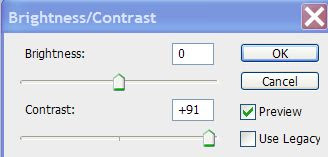


You can see real-life previews of the changes the contrast settings are making to your picture as you pull the slider to the right or the left. I recently had cause to use this contrast for a graphic I was working on starring a tugboat in the Tasman Sea.

This little guy looked impossibly small. The way the colors of the boat contrasted with the colors of the ocean made a beautiful picture. But my initial pic was flat and uninteresting. How exactly a red tugboat on a blue ocean can be visually uninteresting is beyond me. But I managed.

Opening the Contrast slider menu, I started working with it and the differences were significant. Compare the two pictures. Hopefully they are big enough for you to see. Check out the color of the water, the redness of the tug:


The differences are striking.

They are both the same picture. But stronger contrast results in what is clearly a much stronger image. All the information was already in the original photo. Contrast simply made it pop.

Don’t ignore the effectiveness of layering when you are attempting to rescue a flat picture from Low Contrast Hell. Remarkable results can be accomplished when you COPY your picture onto a new layer and wildly bring the contrast levels up. Now work with the OPACITY of this hugely contrasted layer and you can get results that will either be jaw-dropping or really hideous. (This is why “Delete Layer” and “Undo” exist.)

If you’re relatively new to Photoshop, it’s a splendid idea to play around with all the settings in the Adjustment Menu. The vast majority of things that need attention in improving picture quality can be found here.


You may find at times that you want to lighten the contrast of your photo. More commonly, you may choose to lighten elements of the BACKGROUND contrast. If you're working on a graphic where your model is in the foreground -- but the background is so colorful it's distracting, you will want to select that background and tame the contrast a little.


Our eyes are drawn to vibrant color -- or the lack of it. This means that by manipulating contrast the artist can easily manipulate where the viewer's eye goes.


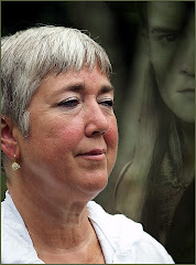
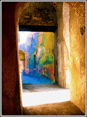
This is an example of REVERSE contrast use. Have a look at this "Lady of the Wall." She is a relatively minor feature on a wall of a building in Rome.
How to make this picture REALLY work bugged me for days. I wanted the eye to go to her, but the background was just so awfully vibrant.
I increased the contrast on the background to her left and gradually decreased the contrast in a gradient across the image from left to right.
The use of contrast this way actually created a visual line across the image. Most people will see her face, then their eyes will travel to that image with the pointy ears to her left and back across her face again. This entire line was created with contrast.
To complete the effect, I added an acid washed border that lightened all the components around the edges of the picture so that the center became very much the main point of interest in the graphic.
Use the contrast options Photoshop offers. Use layers to create that perfect blending of light, color and brightness. Your images will be much more powerful.
Honest.

Monday, March 10, 2008

Create a Visual Experience

Sync Magazine named Gary Gygax the #1 Nerd of All Time. He's the guy in the Hawaiian shirt to the left. (Pic courtesy of Wikipedia.)

I spent one night a week with Gary for nearly six years. But I never met him in person.

He had a profound impact on my life – even though I only spoke to him once.

So who is Gary Gygax…and what does he have to do with a blog that covers Photoshop and photography? Hang in there for a second.

Gary Gygax was the creator of a game called Dungeons and Dragons. His plan was to design a new kind of game – a game where people could experience an adventure together.

He wanted to know what it would feel like to creep into a dragon’s den or experience the heady excitement of being part of a fellowship, embarking on an epic quest.

So what does Gary Gygax have to do with Photoshop and photography? Plenty.

Think back to a picture you saw in a magazine or in a book that really held your interest. I’m not talking about a pretty sunset or an ocean landscape. I am talking about a picture that you looked at for a while because it struck a powerful chord in you.

This isn’t the kind of picture you just look at. It’s the kind of image you examine. The visuals on the page reach out to you, take you gently by your spirit and help you to experience what the photographer or Photoshop artist was feeling at that moment.

For me one of those pictures was a portrait I saw once of rock and roll legend, Janis Joplin. It’s the work of another photographer, so I can’t post it here. But the image had Janis smiling shyly at the camera. She was wearing a big floppy hat and a flower necklace and nothing else. But there was an expression on her face that was quite unlike the brash rocker I knew. The photographer chose to present his image in B&W and that made for an even more dynamic visual.

Okay, okay, you’re saying. But what does that have to do with Gary Gygax? And what does Gary Gygax have to do with Photoshop and Janis Joplin’s portrait?

Gygax wanted to create an experience. When others were designing games with winners and losers, he wanted to re-think everything and re-design it to give his audience the gift of an experience.

Joplin’s photographer wanted to do the same thing with his portrait. He wanted us to know a little more about the singer – but more than that, he wanted to share HIS experience of being with her. He didn’t see the Southern Comfort swilling blues/rocker. He saw a shy girl with flowers and a silly hat.

What stands out in your mind about the image you’ve seen? What makes it strike a chord in you?

Now to the purpose of this WHOLE entry: What pictures have YOU taken that have that kind of power, and will let you communicate your feelings to an audience of people who have never met you…or been to the places you’ve been….or talked with the people you have photographed?

You need to look at a photo and decide what aspects of it will speak to these strangers. Take a look at this list of the Big Three:

1) Does the subject define an archetype? Consider a close-up of a Wise Old Man, A Hard Working Farmer or An Adventurous Woman. Your subject needs to speak to people you don’t know in a language they will understand. If the face alone doesn’t do it – consider putting your subject into an interesting environment doing something that defines them. They are called archetypes because they have elements to them that all people can relate to on some level. The entire purpose of shared photography is to provide a visual people can relate to. Archetypes are great – because they take you half way there.

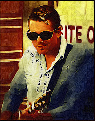
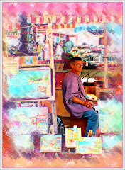
2) Does the image project two things that don’t fit together? Think about a street person in expensive clothing. How about an entire city fit inside a bottle...and floating through space? Consider a photo of a street performer which has been rendered into a drawing with a turn of the century flavor to it. The mind goes right away to visual juxtapositions because it tries to make sense of things that don’t fit. When this happens you have the complete attention of your audience.

3) Can you verbally summarize the point a picture makes in one sentence? We’ve all seen pictures of wide eyed children suffering terribly in Africa. You can see the pleading in their eyes. The message is clear “Help me, please.” It’s powerful…but it’s also an image that has been overused. How about taking that same image – and Photoshopping the image of the child into an image of a sumptuous Las Vegas buffet or casino? What would that picture say then?

Think about the presentation of your graphic: should it be in hyper-colors or Black and White? Would grain make the image stronger or does the focus need to be razor sharp?

Gygax taught me that it was okay to disregard the rules of a game and do away with the whole winner loser thing because the whole exercise is about creating a powerful EXPERIENCE.
When you are attempting to create a great graphic – do the same. Forget the rules. Use every tool at your disposal to create a visual that grabs your viewer by the spirit and makes them a part of the experience.

And give a thought once in a while to the Number One Nerd of all time.

Monday, March 3, 2008

Resolving Resolution...

When I was learning Photoshop, totally understanding the whole resolution thing made my head hurt. I simply could NOT get a straight answer. I got lots of people telling me things and even as they were talking I could feel my eyes glass over.

I really wanted someone to explain what resolution was in plain and simple terms. And I wanted to know what kind of resolution I should have for the various projects I was working on.

Here is the Patented David Thiel Explaination of Resolution And How It Effects YOUR PICTURE.

Ready?

Resolution is how much information is in your picture. MORE information means your picture file is BIG and if you are planning to make a big print out of that sucker, you WANT a BIG file. Why? Because more information means more pixels (the tiny dots that make up a picture) and you WANT lots of pixels to give you a nice crisp print.

LESS information makes your picture file SMALLER. You want smaller files for pictures that you plan to display on the web or use in PowerPoints. The smaller files make it easier for the computer to handle and eat up much less space on your drive. EVERY picture on this blog is a small file which is why they load very quickly. ..but would make terrible prints.

Photoshop and Photoshop Elements make it very easy to change the resolution of your photo.


Go to Image> Image Size and you get this option screen. In the red box is the Pixel Dimension information. Here you see it's nearly 14 Megabytes. This size of file would give PowerPoint a serious headache.


This is the photo in it's "just downloaded" state.

The other two Very Important Boxes are also highlighted. RESOLUTION (inside the green circle) is where you can cut the overall file size.

The value of Resolution will directly impact that 13.7M file size. If you click inside Resolution and change it from 314 to 72, you'll note an immediate change in the file size.

Constrain Proportions is ALSO checked. This is defined in the blue box. If you plan to work with the width or height of the photo size and you don't want Aunt Martha to turn out looking like an alien invader from the planet Ziggat, you want to ensure this box is checked.

So RESOLUTION affects the amount of information in a graphic.

How do you decide what is the RIGHT Resolution?

You decide in advance WHERE you plan to display your work. Lots of artists, myself included, design work for display online...and in PowerPoints. I rarely print. I will nearly always cut the resolution to 72. (If you're printing, you want the leave the file size as large as possible. There are tables for how big these files should be if you're printing a smaller size photo as opposed to a larger one...but save yourself the headache. Just leave the file size BIG.)

The upside of cutting the resolution means I can work very quickly inside Photoshop (the application of filters, for example, is much faster since the software has a much smaller amount of informaiton to work with) and I know the final product will be easily uploaded to blogs, websites and PowerPoints.

The downside: I can't expect prints of any decent quality and if I am EVER planning to print my photo, I will have to do it all over again.

Here's the very best way to have your cake and eat it too: IF you are willing to live with slower Photoshop response time, do all your edits and all your work with the large sized file. THEN reduce the resolution to 72 and "Save As" a reduced file. This way you have ALL your options open.

As always, make sure that you save an UNFLATTENED graphic in the Photoshop format so you can go back and make changes if you like. You'll eat up vast amounts of disc space doing it this way -- but you'll be glad you did when you desperately need to print the photo.

Besides, external drives are MUCH cheaper now and you can always save the photo there.

Thursday, February 28, 2008

Getting Lucky with Celebrities...

Unless you're a celebrity photographer like Annie Lebowitz, getting good pictures of famous people can be really tough. Many genuinely famous people are already not kindly disposed toward photographers they don't know...and with good cause.

Getting that perfect shot is tough. Unlike Annie, who can take time and enlist famous faces in helping her make THE portrait, we have seconds...and it has to be perfect.

Here are a few tips you may want to consider if you are going after a Famous Person To Photograph:

1) Try to catch them in an unguarded moment at a public event. I still remember seeing a picture of Liv Tyler, pushing a stroller through Central Park. She's smiling patiently at the camera and you can feel a little bit of what it must be like to be her. She can't even take her kid to the park without being photographed. I don't consider this to be a "public event."

Here's Kevin Bacon. He was being interviewed on an early morning news show. He was there to be seen. I took a number of pictures of him there...and waded through them until I found one I liked. There's an odd expression on his face and each time I look at this picture, I wonder what he was thinking about.

It's what I mean by "unguarded." He doesn't have a "footloose" smile on for the camera, but there's something going on in his mind.
I like this pic a lot. In many compelling portrait shots the subject ISN'T looking at the camera. When you get that second in real life, it can make for a very strong image.

A minute later, he put his sunglasses on and headed out.

Of course you need to shoot and keep shooting. You will need to wade through a LOT of photos to get the one that really works. Think of it as "Forcing the Fluke Great Shot."

2) Try to get your subject doing something they really like. Living in Edmonton has it's advantages. The Edmonton Grand Prix is one of them. Why? Because Hollywood icon Paul Newman likes the champ cars -- and is in partnership with McDonald's on one of the teams.


I waited all day in the hot sun for an opportunity to get a good photograph. Most of them were of the back of his head...his hand reaching for water. But my patience was rewarded when his driver won the race -- and he came out of his command center with a genuine smile on his face. It's a real emotion on a famous face.

You can kinda see Cool Hand Luke peering back at you. Or maybe Butch Cassidy...or........?
My point is that in that second, as Newman made his way toward to little red scooter he uses to get around on at Grand Prix events, the guy was genuinely happy. And that is what makes the picture work for me. Leathery skin, oversize sunglasses and all.


3) Make sure your lens is clean, that you have batteries charged and that you have chosen your spot with great care. I think it is SORT of like a hunt. Like any hunter, you need to be completely ready for that one second. And in that one second your equipment, your concentration and your angle have to be perfect. Just think of how you'd feel if you raised the camera to your eye and saw you have a dead battery -- or your thumbprint on the lens.


4) Canadians are polite...mostly. When photographing celebrities, act like a Canadian. Think about it: how would YOU feel if someone you didn't know started taking pictures of you or your kids? Celebrities are the same way...only their sensitivity is heightened. They have no idea what you plan to do with the pictures. If they ask you to stop...stop.


5) Don't be afraid to try a fresh angle. Harry Smith goes into millions of homes each morning. Since much of his show is taped outside it's easy to get pictures of him looking exactly like you'd expect him to. I had time to think about how this shot needed to be composed. I wanted him looking off-frame with the "context" (a fancy way of saying "the place where he is doing what he does") behind him. I lined myself up and waited. I think this photo is more interesting than the standard "index finger on the chin" shot most other people were taking.

The camera off to the left of the frame -- as well as the people in the background are all out of focus. Only the subject is sharply defined and he looks intent on something. It's a use of negative space to create a context...and to make a statement about the subject.
Celebrity pictures can be wonderful. I enjoy looking at them because if the picture is taken properly, you can look at a well known face and see them in a REAL moment. And in that flash of a second you need to press hard on the shutter button and hope your planning and work will pay off.

Wednesday, February 27, 2008

Seeing The Picture Through All That VACATION!

Travel is the great passion of our lives, my wife and me. We are determined to see as much of the world as possible before we get old(er) and unable to travel. I've often wondered what it is about travel that makes my heart sing.

What is it about those precious few days before you leave on vacation? Why does my heart beat faster? Why does music sound better? Why does food taste wonderful?

I am pretty sure that we are born to go out into that great big world and "take a look." Photographers have an added mission -- to communicate their vision to people they may never meet.

Taking the picture is about trying to SHOW how it FELT to stand at the foot of an ancient Aztec temple...or what you may have thought as you looked at a person sleeping outside Central Park in NYC with all their worldly possessions loaded into a shopping cart. I took the pic on the left on the last day of our last trip to NYC and I really felt moved by the image of this woman sleeping in the midst of all that activity. It didn't seem right to photograph her face...the posture of her body was enough.

The picture simply didn't work in color. It seemed far too ugly. This picture needed to be grainy and uncompromising. This is, after all a very definate "up yours" from street people, isn't there?

You need to stand and THINK about a photo before you take it. Think about how you plan to compose it. Think about how the visual you are creating will show how you felt as you stood there. We wound up at a Renaissance Fair one enchanted summer afternoon. Having never been to one of these before, I was simply blown away by the color and the passion of the people there. Some were in costume. Some weren't.

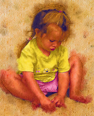
This precious woman WAS. And I loved the idea that after all these years she could still dream. And she could still dress up and put flowers in her hair. I wanted a picture that showed her doing something...and a picture that would allow us to look into her heart...just a little.

When we're on vacation, there's a tendancy to concentrate on where you are going, on the next meal or drink...to fail to be THERE in the precise place you've travelled to get to.

When you travel, consider taking your camera everywhere. Always try to see the picture. And after you've SEEN it, try to think how you will communicate that to other people.

They (whoever "they" really are) are planning to shut down Coney Island soon. How sad. This place is an icon. But it continues an existance in New York's progressively tough neighbourhood anyway. There are rides and food stands. There is a massive boardwalk and a beach and, of course Nathan's which is the birthplace of the hot dog.
I took a ton of pictures on the day we went there. This is my favorite. I looked at these people for a while before deciding how I would take the picture. I wondered if they had maybe met at Coney Island or courted there. I wondered who they were...and smiled when I saw the tender way the man had his arm draped over the shoulder of his bride. They were sitting together enjoying the day in the manner that suggests that they have enjoyed many days together.
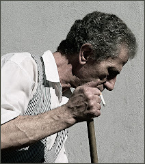
I chose to put my subject a little off center, because I suspect that they have fallen a little out of step with the society that surrounds them. And they don't seem to care...which is the coolest thing of all.
Travelling is an experience. It is the task of the artist to try to communicate that sense of wonder to their audience. Look always around you. Study the environment. Smell the air, look at the people. THINK. THINK about how you will convey this in a visual image.

Thursday, February 21, 2008

To Lightroom or Not to Lightroom...???

"That is the question....whether 'tis nobler in the mind to suffer the slings and arrows of outrageous workflow -- or to take up arms against a sea of software headaches and by opposing...end them."

Okay. With all due apologies to Mr. Shakespheare here's the question a lot of new and old Photoshoppers are asking: "Just what IS Lightroom...and why should I care?"
Even after having worked with it for a year, I have to say I am not entirely sure. This is the ONE thing I KNOW for sure.
LR is designed to be the FIRST step in your workflow. You return from shooting the California Artichoke Competition. You take the 4,325 pics you've just taken and import them into Lightroom. This is very simple. In Lightroom, you choose Files> Import > and choose the source. Up pop the pics for importing. Here's where you can add the Keyword information.
The screen to the left will pop up once LR has sorted through the Import options and ensured you aren't importing the same picture twice.


The Keyword area is circled in green. This is where you attach information that will help you find your photo again. This is a finished and photoshopped pic I took on a trip to Australia and New Zealand. I'll be able to find it again by inputting the key words: Hotel or Australia Finished, or Balcony or traveller. As you fill in the information in the Keyword area be as thorough as you can. This will save on the pulling at your hair phase when you are looking for a specific graphic amid thousands of pictures.


The second phase of LR is accessed through the menu in the upper right hand corner of the screen: DEVELOP. This was intially designed as a pre-Photoshop area. The idea was that you would do all the prep work here: the cropping, the sharpening, minor corrections etc. using what is really a very extensive menu.
It's become quite a bit more than a minor pre-Photoshop area since you can do a TON of stuff here with no fuss and hardly any trouble.
It is from here that I will most often go to Photoshop for final processing. There's an option accessed through Photo> Edit in (your version of Photoshop) which minimizes LR and opens up Photoshop.
There are many very very cool options in LR. That's why people write books about it. You can create slideshows, publish your work to the web, access a ton of print options and much more. My absolute FAVORITE thing about LR is the crop tool (see the "Most Useful Piece of Photography Advice" posting below.) but there are many other wonderful things you may want to check out.
The first edition of LR was fraught with problems. People spent weekends inputting information and importing photos only to find that a software glitch wiped it all out. There was talk of crashing computers and strident cries for the immediate and painful execution of each person ever associated with LR as well as their immediate families...and pets.
Adobe has now released the second version of LR and many of the clunky things have been wiped out and what remains is a pretty servicable -- if kinda pricey -- package that WILL one day be a part of most graphic pro and amateur workflow options.
Take it out for a free 30 day test drive at http://www.adobe.com/
I'd be interested as to what you think of LR.

Monday, February 11, 2008

Why Use Black and White?

Flashback: It's the late 1970's. I am in college, in a darkroom, busy as I prep a project in my photojournalism class. I remember the smell of the chemicals, the tempermental enlargers...and the sensation.

The sensation is that prickling feeling on your neck as you watch a really good picture slowly appear on photography paper. It's a portrait of a friend of mine. I see highlights in her hair -- a perfect catchlight in her eyes and that gentle grey light playing across her face. It's a great picture. I sigh with satisfaction and pride.
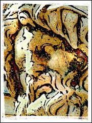
Our photography instructor, an ancient man who smells of tobacco and spits when he talks, comes up behind me. I step aside so he can admire my photographic harvest. He peers at the picture, which is now in the stop bath. He looks at me. He looks back at the picture.

"Got lucky, huh, Thiel?" he growls finally.

Yup. I did. But still -- it's a great picture. It's really good. I have a clear mental image of it still, even though the pic and the friend have slid far out of my life.

There remains something nearly mystical about a well done b&w photo. There's a singularity of vision -- a simplicity that can make your point with dynamic power.

And you no longer need a darkroom to do it. If you own Photoshop CS3, it's as simple as going to Image> Adjustments> Black and White. This adjustment is nearly perfect in CS3. If you are working with an earlier version of Photoshop OR Photoshop Elements, try Image> Adjustments> Hue/Saturation.

If you're ancient like me and still remember how the paper you chose to print affected the final visual, you owe it to yourself to check out http://www.alienskin.com/. This company has issued a filter set called "Exposure" that will create some utterly amazing black and white conversions.

But let's talk about two things that make Photoshop an ideal vehicle for this process:
  • Your ability to select certain portions of the photograph
  • Your ability to decide what percentage (the opacity) of the effect is done.

At the top of this article is a graphic called "Roxy." It's an old theater I saw somewhere in Montana. The pic was taken on a grey day and needed intensive work to punch up the contrast. I also removed the background and inserted a nasty looking sky. To send the graphic over the top, I added a lightning bolt. Finally I selected the sign ONLY and used Inverse (Select > Inverse) so that I could draw MOST of the color out of the rest of the photo.


It's interesting visually -- because it presents an impossible picture. A tired color set against a black and white backdrop.


Don't confine yourself to simply using Black and White. There are a number of very pleasing effects you can get by working with the Adjustments menu -- and if you want to take Alien Skin's Exposure out for a free 30 day test drive -- you'll find even more things you can do. Blues....greys....even greens can breathe fresh life into a tired picture.


This is a big topic. It occupies a significant section in our upcoming "Perfect Portraits" manual, which will soon be available at http://www.photoshopbasics.com/ . (Hint, hint.)