Flashback: It's the late 1970's. I am in college, in a darkroom, busy as I prep a project in my photojournalism class. I remember the smell of the chemicals, the tempermental enlargers...and the sensation.
The sensation is that prickling feeling on your neck as you watch a really good picture slowly appear on photography paper. It's a portrait of a friend of mine. I see highlights in her hair -- a perfect catchlight in her eyes and that gentle grey light playing across her face. It's a great picture. I sigh with satisfaction and pride.
Our photography instructor, an ancient man who smells of tobacco and spits when he talks, comes up behind me. I step aside so he can admire my photographic harvest. He peers at the picture, which is now in the stop bath. He looks at me. He looks back at the picture.
"Got lucky, huh, Thiel?" he growls finally.
Yup. I did. But still -- it's a great picture. It's really good. I have a clear mental image of it still, even though the pic and the friend have slid far out of my life.
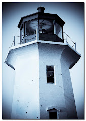
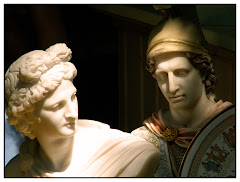
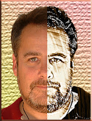
There remains something nearly mystical about a well done b&w photo. There's a singularity of vision -- a simplicity that can make your point with dynamic power.
And you no longer need a darkroom to do it. If you own Photoshop CS3, it's as simple as going to Image> Adjustments> Black and White. This adjustment is nearly perfect in CS3. If you are working with an earlier version of Photoshop OR Photoshop Elements, try Image> Adjustments> Hue/Saturation.
If you're ancient like me and still remember how the paper you chose to print affected the final visual, you owe it to yourself to check out http://www.alienskin.com/. This company has issued a filter set called "Exposure" that will create some utterly amazing black and white conversions.
But let's talk about two things that make Photoshop an ideal vehicle for this process:
- Your ability to select certain portions of the photograph
- Your ability to decide what percentage (the opacity) of the effect is done.
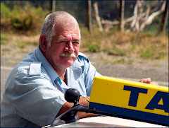
At the top of this article is a graphic called "Roxy." It's an old theater I saw somewhere in Montana. The pic was taken on a grey day and needed intensive work to punch up the contrast. I also removed the background and inserted a nasty looking sky. To send the graphic over the top, I added a lightning bolt. Finally I selected the sign ONLY and used Inverse (Select > Inverse) so that I could draw MOST of the color out of the rest of the photo.
It's interesting visually -- because it presents an impossible picture. A tired color set against a black and white backdrop.

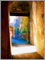
Don't confine yourself to simply using Black and White. There are a number of very pleasing effects you can get by working with the Adjustments menu -- and if you want to take Alien Skin's Exposure out for a free 30 day test drive -- you'll find even more things you can do. Blues....greys....even greens can breathe fresh life into a tired picture.
This is a big topic. It occupies a significant section in our upcoming "Perfect Portraits" manual, which will soon be available at http://www.photoshopbasics.com/ . (Hint, hint.)