I am standing in the French Quarter on a hot summer afternoon. There are puffy blue clouds in the sky and not a hint of rain. I can smell good food coming from the open (and very inviting) door to a restaurant. I can hear hot jazz coming from a bar down the street. There's a lazy, contented feel to my world. It's full of things I could do and places I could go. But at this exact second, I am content to stand there and let NOLA seep into my spirit.
How do you summarize what a moment felt like in a single image? It's impossible. Take New Orleans, for example. The city is still recovering from Katrina -- but the jazz is hot, the food is good and the people are smiling. It's a place that never settles into sleep. There's always something going on. There's always somewhere wonderful to go. You can tour the devastated outskirts of the Big Easy or hang out on Frenchman Street -- where the locals go to avoid all the nasty business that goes on at Bourbon Street.
There's just so much life rising out of the ashes. There's magic on the streets, in the music and the food. It really feels like New Orleans, as an entity, accepted the devastation from Katrina, shrugged, smiled and picked up a trumpet to lay down some great jazz.
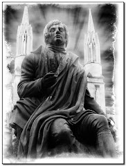
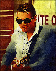
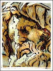
So my plan was to try to convey that feeling to you with this image.
This isn't a blog about technique. (On the off chance you care: The graphic is a composite of two photos. The primary photo is a statue of Al Hirt -- the New Orleans trumpet virtuoso. The glow comes from a deliberately ragged extraction, inner glow and drop shadow from the Layer Style menu and a touch of white corona from Alien Skin. The cemetary shot has been changed into a "painterly" effect with the Artistic Tools as well as Virtual Painter.)
This blog is about relaxing and BEING where you're going so you can convey that feeling to others via your graphic design.
If you find yourself in a new city and are intent only on getting where you are going you're going to miss what it really feels like to be somewhere exotic. Let's face it: most tourist places look the same.
But how does the place feel?
On each trip, let me urge you to take a few minutes to just stand or sit. Let me urge you to let the cells of your spirit open up and enter into the stream of where you are. On the heels of that potentially deadly artsy observation, let me make a few suggestions for how to construct a graphic that "says it all."
1) Make Notes. My wife excels at this. She'll plop herself down on a sidewalk, grab a pen and start writing. I have really tried this -- but it doesn't work for me very well since I am pretty old and have a tendency to put stuff down and forget about it. But in any case, as you sit and start your project, keep all those sensory things in the front of your mind. It will help you stay on track.
2) Start Designing your Graphic as you Take the Picture. I will often have a rough idea in mind for how I am going to Photoshop the photograph. Sometimes I will already have a project in mind before I get on the airplane. This makes things much easier since I am actively looking for things that will fit the project I have in mind.
3) Don't be afraid to Ignore Point #2. If you are sitting down with your images, don't be so married to your original design that you ignore options that will make your design stronger. We've all had "happy accidents" which occur as you format the design. Push things around on the screen. Relax. The "Undo" command is a much better invention than sliced bread.
As you start work try to remember how your image smells. Is there food cooking? Flowers? Is the the scent of hot sun on asphalt? Try to remember the sounds: music, conversation, laughter. Try to imprint every possible thing on your memory and you will find designing a graphic much easier.
I am guilty of rushing from place to destination and not seeing much except the street signs. But every so often I manage to slow down. After all...it's not so much about the destination as it is about the journey, right?