I think he SHOULD have said “We are never so close to God as when we really learn how to use our Contrast Settings in Photoshop.”
Contrast is a delight. It can transform a guy glumly contemplating a flat picture into a happy dancing graphic artist. Contrast is the perfect way to brighten colors and create scenes that pop off the page and leave lasting impressions in the eyes of the viewer.
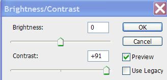
And Contrast has never EVER been as wonderful to use as it is in Photoshop CS3. The interface is held to one little slider. You’ll find this little gem under Image> Adjustments> Brightness/Contrast. It will bring up a slider that looks like this:
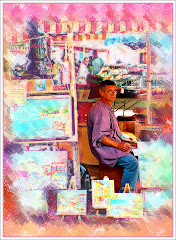
You can see real-life previews of the changes the contrast settings are making to your picture as you pull the slider to the right or the left. I recently had cause to use this contrast for a graphic I was working on starring a tugboat in the Tasman Sea.
This little guy looked impossibly small. The way the colors of the boat contrasted with the colors of the ocean made a beautiful picture. But my initial pic was flat and uninteresting. How exactly a red tugboat on a blue ocean can be visually uninteresting is beyond me. But I managed.
Opening the Contrast slider menu, I started working with it and the differences were significant. Compare the two pictures. Hopefully they are big enough for you to see. Check out the color of the water, the redness of the tug:


The differences are striking.
They are both the same picture. But stronger contrast results in what is clearly a much stronger image. All the information was already in the original photo. Contrast simply made it pop.
Don’t ignore the effectiveness of layering when you are attempting to rescue a flat picture from Low Contrast Hell. Remarkable results can be accomplished when you COPY your picture onto a new layer and wildly bring the contrast levels up. Now work with the OPACITY of this hugely contrasted layer and you can get results that will either be jaw-dropping or really hideous. (This is why “Delete Layer” and “Undo” exist.)
If you’re relatively new to Photoshop, it’s a splendid idea to play around with all the settings in the Adjustment Menu. The vast majority of things that need attention in improving picture quality can be found here.
You may find at times that you want to lighten the contrast of your photo. More commonly, you may choose to lighten elements of the BACKGROUND contrast. If you're working on a graphic where your model is in the foreground -- but the background is so colorful it's distracting, you will want to select that background and tame the contrast a little.
Our eyes are drawn to vibrant color -- or the lack of it. This means that by manipulating contrast the artist can easily manipulate where the viewer's eye goes.

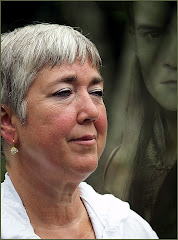
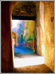
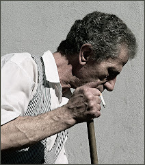
This is an example of REVERSE contrast use. Have a look at this "Lady of the Wall." She is a relatively minor feature on a wall of a building in Rome.
How to make this picture REALLY work bugged me for days. I wanted the eye to go to her, but the background was just so awfully vibrant.
I increased the contrast on the background to her left and gradually decreased the contrast in a gradient across the image from left to right.
The use of contrast this way actually created a visual line across the image. Most people will see her face, then their eyes will travel to that image with the pointy ears to her left and back across her face again. This entire line was created with contrast.
To complete the effect, I added an acid washed border that lightened all the components around the edges of the picture so that the center became very much the main point of interest in the graphic.
Use the contrast options Photoshop offers. Use layers to create that perfect blending of light, color and brightness. Your images will be much more powerful.
Honest.