Thursday, May 29, 2008

Photographing Kids


Kids are great to photograph, right?
They are unpretentious, they are sincere and -- if you can get the right kid -- they are wonderful subjects.
On the flipside, you need to forge a personal bond with them, some kind of relationship, that allows them to be comfortable in front of a camera and natural in all they do. It's that "naturalness" you are trying to capture in that split second the camera gives you to take the shot.
If you planned to take a picture of an adult, you would take the time to invest yourself in getting to know them, right? It's no different for kids. You need to take time to kibbitz with them, to get to know them and then the great gates of images open.
I spent close to half an hour with the child in this picture. She happens to be my granddaugher, but the fact that I was sitting on my porch, taking picture after picture may have served to make the whole picture taking process more difficult. The photographer, whether they are photographing children or adults, needs to realize that the camera itself is a barrier to interacting with the subject. It's a great black block of matter that shows them to the world. While it's true that kids are less likely to flinch in the face of the lens, it's also true that, as an artist, you are looking for a way to present that youthful presence to an audience.
In this particular picture, she was walking away and then turned to say something to me over her shoulder. I captured the image here and so the image is held here in that second.
Take time to understand the subject of your portrait. Try to capture them in that fraction of a second where they show you who they are. Respect them as complete people.
For this picture, I copied my layer and then converted the picture to black and white. Then I worked on the Opacity, reducing the blend between the two to 50%. This adds a nice "hand tinted" look to the photo -- predominantly on the dress and hair highlights.
The picture was then flattened and framed and we're done.

Tuesday, May 20, 2008

Photography, Photoshop and PowerPoint

They are the big three: Photoshop, Photography and PowerPoint. Think about it for a second: you shoot raw with your camera, you make it into art with Photoshop and then you display image after image with PowerPoint.

Feeling a little wild? Add music. You can go completely nuts and even insert transitions and custom animation to create the kind of travel album "slide show" that won't leave your guests clawing at the door trying to escape.

I've posted a lot of articles here about how to get the travel shots you want -- which pretty much deals with the "Photography" aspect. It goes without saying that you need to take good pictures to give yourself the "material" you need. To summarize the high points about travel photography:

1) You need to examine your camera bag, ensure you have charged batteries and back up batteries, memory cards, different lenses and gear that will enable you to shoot despite the weather.

2) You need to be absolutely "present" as you travel. Always look for the picture that tells a story or conveys a sentiment or emotion.

3) You need to be organized.

Photoshop treatments have also been covered extensively here. There are a ton of ways you can improve a picture. The one quick point I will make here is that you should reduce the resolution to 72 (Image> Image Size> Resolution) if you're prepping photos for a PowerPoint presentation.

You will be displaying them in a monitor or through a projector. Bigger resolution isn't necessary and will make the images harder for PowerPoint to handle. You run the risk of jerky looking movements of images of you load them down with too much unnecessary visual data.

PowerPoint is the thing many photographers don't know much about. And this is a great pity, because it's a program ideally suited to displaying your work to the heartfelt "oooohs" and "ahhhhs" of your adoring audience.

It's easy to use and most people have one version or another on their computers.

To INSERT an image onto a PowerPoint slide, go to Insert> Picture. At this point you decide where your pic is coming from...most likely it's your "File" -- which means you plan to take it off of your computer.

By default, PowerPoint will insert the picture in the precise center of the screen.

Add New Slides (Insert> New Slide) for each new slide. (If you've created a background as I did in the example above, you may do well to COPY the slide and insert a new picture on the existing background.)

You may also want to consider bringing in each new picture with an animation. (Slide Show> Custom Animation) I have yet to find a better method for introducing pictures than "Fade." It's elegant, doesn't get in the way of your graphic and adds a touch of class to your presentation.

To make the slide show run on it's own, you will need to use a nifty little tool called "Rehearse Timings." (Slide Show> Rehearse Timings) As you advance through the pictures by pressing the space bar, your Rehearse Timings will remember the way you did it. If, at the end, you are happy with the slide show simply accept the option that allows you to "Save" your settings.

Unless it's a really complex image, I will leave each image on-screen for seven or eight seconds. A timer appears in the upper left hand corner of the screen which gives you both the time for each slide AND the time for the overall presentation.

Finally, you may want to "Save As" a "PowerPoint Show." This means the instant you click on the nifty little icon, the PowerPoint starts and runs itself -- leaving you free to talk about the pictures your adoring audience is enjoying.

There's a NEW PHOTOSHOP COMMUNITY

I haven't been around the blog much because I have been busy setting up a new community on Facebook. Web Jedi, Mark and I are pretty excited about it. We've invited our membership from Photoshop Basics and a lot of other people to join in and see what happens.

We've announced our first contest...and there's even a prize.

This isn't something we're making money from. It's a free community designed for all sorts of Photoshop users from advanced to beginners. We really want to create a community that allows people to share ideas and concepts, pictures and feedback.

We're nearly 30 members right now and the exciting thing is that they are from all over the world so we get a great cross section of people. Check it out at this link. Remember it's free. http://www.facebook.com/group.php?gid=2332124074


Feel free to pop by and have a look.

Thursday, May 15, 2008

Take another look at Black and White


There is a powerful thing that is created when a graphic goes from color to Black and White. You see details more clearly in a B&W than you do on a color graphic.


See that cute kid? I am blessed with children in my life who know how to pose. I asked her not to smile. She didn't and this is what happened.
Which picture is stronger?
I don't see a contest here. Despite the fact that the subject matter (the aforementioned cute kid) is visually interesting, the job of the graphic artist is to make the visual "more gooder."

One of the great things about Photoshop CS3 is the control we are given over the whole desaturation process. You will find this little gem under Image> Adjustments> Black and White. This will bring up a spiffy new menu that hasn't existed before.
To really understand the power of this menu, you need to do one of two things. First: open a picture that is LOADED with color. Play around with the sliders and watch the voodoo-magic-way-cool stuff that happens to your graphic as you do. The settings I used on the original are represented on Black and White graphic. But you will find that there are WAY too many options represented here for a wee blog.
The second option is, of course, to pick up our "Perfect Portraits" course from our website. It's due for release in the late summer/early fall.
Meanwhile -- take a hard look at the many many options you have at your fingertips with this wonderful little adjustment, which I happen to think is the second greatest thing about CS3. I'll tell you what the Absolute Coolest Thing is on a later blog.
Just three things you may want to keep in mind BEFORE using the B &W Adjustment menu:
1) Always ALWAYS work on a layer copy. This way if you mess it up the world, as you know it, won't end.
2) Do your other adjustments (sharpening etc.) before you start working in B&W.
3) You will often find that INCREASING THE CONTRAST before taking the whole thing to black and white can greatly enhance the finished product. Remember that the great luxury Photoshop offers is the ability to work in layers.
Finally -- you may want to consider simply desaturating PART of your graphic. I have one displayed on my NAPP site (the link's at http://www.photoshopbasics.com/ ) that is only an orange umbrella on an otherwise black and white graphic. Very easy to do -- and it can be remarkably effective.

Tuesday, May 13, 2008

Internet Woes...and Whoas!

"They came from all over the continent and beyond. They came with dreams and greed and determination and nearly all of them failed. But for the few, the very chosen few, who had the exact right combination of luck, determination and fortitude, there were riches."

The quote is from a book called "Golden Dreams" by a relatively obscure author with the highly improbable name of Joseph Wrongway. (I suspect Joe has heard every possible joke about his name, so we'll let it go.) He was writing about the gold fields and the prospectors they drew. The perverse thing is that two miners could be literally side by side: one would hit a rich vein and the other would find nothing. (The pic to the right was taken in Alaska, which, frankly is as close as I have ever come to actual gold fields.)

This makes me think of the Internet. If our century has a gold field, this is it. And it's fitting, in some perverse way, that this field doesn't really exist anywhere. You can't GO to the Internet, although you can see it on your monitor. No one really knows exactly what it is because it isn't really just one thing. It's a conduit, I suppose.

It will carry my thoughts as I sit here in my office typing, to you. And it doesn't matter if you are next door or in India. We can still exchange ideas.

Your choice is what voice you choose to listen to...what communities you might want to belong to...what internet stores you choose to support with your hard earned dollars. It's all the Internet. Instant communication...instant information. Anywhere.

I am old enough that I am really impressed with stuff like that.

The Internet is also like the klondike gold fields because there are a few people who will crack the secret code and get rich. I understand the guys who own Google made two billion dollars in one hour when the stock jumped. Those kinds of earnings dwarf even what the richest gold strike of all time earned. And they did it in an hour.

All of the massive companies: Microsoft, Adobe, Yahoo, Dell and so many more make piles of money or send out cost effective precisely targetted email advertising through the Internet.

Amazing.

I started working on Photoshop Basics in 2004 as I remembered how much I struggled in the beginning to learn the simple basics of this great but seriously intimidating program.

I was frustrated. I had expended hundreds of dollars and hundreds of hours trying to figure out Photoshop. The whole thing made me nuts. There just didn't seem to be anywhere that just offered me a SIMPLE and STRAIGHTFORWARD package of information IN ONE PLACE that would show me the basics.

That's why I wrote the first course "Learn the Basics of Photoshop in SIX HOURS." My feeling was that there were some basic things that you HAD to know in order to start using the program properly. So I thought about it for a long time and then wrote them down.

That little course has done pretty well for itself...and that led to more and more courses.

Each one takes somewhere between five hundred to a thousand hours to write. It's not like a novel. You'd be surprised to learn how difficult it is to explain the steps even for something simple like create a new layer.

We've gotten some great feedback on our courses from more advanced users as well.

I don't have any illusions about getting rich doing this. I expect that people will enjoy the courses, maybe share their work. My ultimate plan is to create a community for Photoshop users, new and old, to share ideas and information. To paraphrase myself in the 70's, that whole notion strikes me as "way cool."

At the nexus of everything is involvement. Web Jedi (Mark) and I have put in countless hours trying to make it easy for you to get involved.

We have made sample lessons available for free.

We've just released a great "mini course" that goes into the nuts and bolts of stuff like creating Fantasy Art, totally off the wall text treatments and one of the most interesting portrait treatments you'll see.

It's a course called "Setting Your Brain Free" -- and it's available on our site (http://www.photoshopbasics.com/ ) for $9.95.

Is this an ad?

Sort of. But more than the ten bucks, we'd like to KNOW people are interested in what we're doing and are prepared to give it a try.

We really want to create a community where people can come and talk and share.

But I often have the feeling I am standing on my little six foot square claim on the Internet gold field trying to attract attention while there are six million other people trying to do the same thing.

Mark (website jedi) and I are starting to feel the strain. We don't much want to roll the potentially expensive dice with Google Adwords or the myriad of internet publicity options out there.

If you'd like to be a part of this, you need to let us know. We have email. We have products. We have a website and we'd love to hear from you.

Think about it.

Wednesday, May 7, 2008

To "Borderly" go where no man has gone before...

First I don't hear from you guys in weeks and have nearly talked myself into thinking I am talking to myself on this blog -- and then I get a bunch of emails.

Sandra from somewhere in England wants to know how she can create the "photo realistic borders" around her picture.


I really like this effect and I use it a lot. It's one of those things that adds a nice "snapshot" look to a photo.


Here for example is a picture of a dog that would have happily gnawed his way through that fence to take a chunk out of me. So I took his picture. The finished pic is here. There's a black border around it and the graphic itself looks like it's lifting off the backing because of the shadow.


Here's how it was done.

First duplicate your main photo. On the PC the command is "Control J," which brings up a carbon copy of your graphic. Click on the layer you have just created. It turns blue to show it's active. Go to the bottom of Layers . I've highlighted the little "fx" symbol. Click on it. This brings up a whole Layer Style menu.


You want to create a "Stroke" around your graphic so click where you see I have clicked on the Layer Style menu and you will see the Stroke Menu Options listing coming up on the right hand side.


Let me draw your attention to the COLOR area. It's highlighted in blue. If you click on the square of color (it's that black block) and move your cursor around the desktop, you will see that Photoshop makes every color you can see there available as your color selection.

It's always good form to take your Stroke color from another color pre-existing in your picture. So I rested my cursor on one of the dark spots on the friendly doggie and accepted the color selection.

Now you need to decide how thick you want the stroke to be. You'll find this in the blue box marked "Structure." We want a nice thick border here. So 3 px should do it. You aren't going to see any difference unless you change the Position Option to INSIDE.


Here you have a nice black border around your picture. Almost done. Just a little flash left. Click on the Drop Shadow selection. I like the settings in this "Layer Style" screenshot.


If you're following along with me on this tutorial, you don't see anything, right? That's because we have added a Drop Shadow to an area that is BIGGER than the graphic.

So there's one more step.


You need to increase the size of you CANVAS. The word CANVAS is in big letters because you don't want to increase the size of you "Image." So go to Image> CANVAS Size and you will get this menu.


Try increasing the NEW SIZE settings by about .25 inches. This is pretty simple math, even for me.


A wee note here: if you wanted to add to the bottom of your graphic, for a title or a date etc. you could change the anchor position, which is a very cool option when you want it.

Also you can pick the color of the extension you are choosing by clicking in the color block to the right of Canvas extension color. This is a very spiffy thing if you are going to increase the top portion of a stock photo so you have a writing area. You can match precisely the same colors on your graphic by running your cursor over the picture.


You may feel free to let loose with a hearty "Tuh-DUM" when you're done.

Monday, May 5, 2008

What to do When the Photo Really Stinks

Okay. I almost didn't post this blog for three reasons. Reason number one: The picture we are going to be working on sucks. The second reason is that posting a picture that sucks and actually admitting that I took it is tough. And the third reason is that, no matter what I do, this project's BEST outcome is that it won't suck -- but may turn out an image that is sort of interesting.


But at Photoshop Basics, we're all about working in the real world. And a real world fact is that sometimes we take cool pictures that stink.

The bottom line, however, is that a picture that stinks when you take it will become only slightly less stinky after you Photoshop it.

But having said all that: Let's say that you're on vacation in New Orleans. You're taking a ghost tour given by a guy who is only slightly more interesting than your average Sherwin Williams paint salesman.

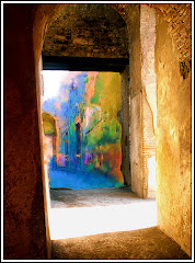
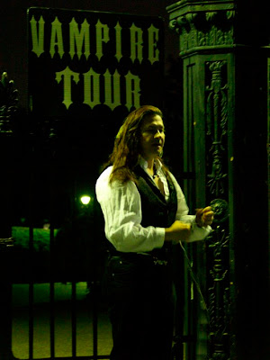
As you pass by Jackson Square you see a guy with long hair standing in front of a dramatic gate about to lead a Vampire Tour.


What do you do? If you're like me, you take a picture. Because it's really dark out already (vampires and ghosts don't come out during the day apparently) you crank the ISO to 1600, point, shoot and pray.

That's what I did and I had high hopes that maybe just maybe I had lucked out and would see a great image on my screen. I mean what goes together better than New Orleans and vampires? I kept trying to convince myself that it would work because it looked okay on the preview screen of my Olympus eVolt 500. (But I have lied to me before...)


What I saw made my whole spirit deflate. That's it. It's a grainy mess. But still there are dramatic touches like the guy's hair and the sign and that great gate. There has to be something you can do to save this image, right?

The answer? "Kinda."

The definitive answer: "Maybe." There's no way I am going to be able to get rid of the grain. There's little I can do about the blurry focus on his hands. But the gate's got detail and the sign can be read so what do you do?

You need to obscure the faults in the picture and make it look like you meant for it to be that way. First you work on the picture and sharpen it. You work with the contrast levels and you ADD grain.

I know what you're thinking. "Did he say ADD grain to a photo that's already grainy?"

Yup. The reason for this is that the grain you added will hide the grain you didn't want there in the first place. In effect, we're evening it out and making it look as though we, photographic geniuses that we are, PLANNED it to look grainy and creepy.

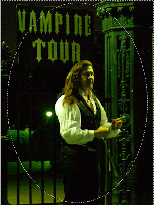
Take your Elliptical Marquee Tool (which is my nomination for Most Pretentious Name For A Tool in Photoshop) and define a circle in the middle of your picture. We want most of the image here to work on. Next you go to Select> Inverse so that the outer border is selected.

Make this a nice, deeply grained desaturated (which is a fifty dollar way of saying "made into Black and White") border. If you are one of the fortunate few that can afford Alien Skin's Exposure 2, you will find a wealth of settings to add a little color to the picture. We're trying to create an aged look.

Press Control+J to create a new layer and work on your border.

The cool part is coming. Remember fingerpaints? Take your Smudge Tool and work all along the circle. The idea here is to create a sort of hazy poorly defined border for the next few effects we are planning to apply. Be careful around the "V" in "Vampire" because this needs to be readable. (After all, where's the allure in an "Ampire Tour?")


If you are following along with another picture, you know that right now it looks REALLY terrible. I agree. But don't give up on me just yet.

Reduce the Opacity on the border layer to about 50%. Allow the "Red Bleach" layer to drop to about 75% so that the third layer (Background copy) comes up just under the main picture.

I know, I know...it's REALLY terrible now, right?

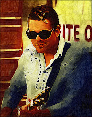
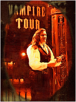
Okay here's where a great plug in comes to the rescue. I am talking about Virtual Painter 5. Apply this to the "Red Bleach" layer using the Watercolor setting.

Take one more Smudge Tool Tour of the outer border. This time you are trying to blend the two layers as smoothly as possible. This is accomplished by blending straight lines to straight lines as on the bars. You still want the circle defined. But you want it to look more like an ill defined pool of light. This serves to highlight the areas where the image is strong (the gate, the sign the guy) and minimize the places where it seriously sucks.


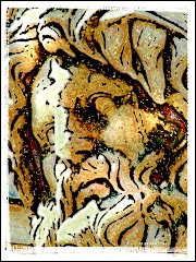
When you're done the result should be the smooth transition between the artwork and the border. It should look something like this.


Is it a great picture? Nope. I still don't think horrible photography can be saved by Photoshop. But you can at least make it more interesting to look at.

That's what's been done with this picture. It's more interesting.

And it doesn't suck.

The Ten Commandments of Photoshop

Susan R. from Ohio wrote to ask what would be good advice for a person just starting with Photoshop. First, I’d suggest buying a copy of “Learning the Basics of Photoshop in 6 Hours.” (hint hint)

But here, in no particular order are the commandments I believe have been handed down from Photoshop guru to acolyte for many years now.

1) Thou shalt always work upon a copy of thy original otherwise thou shalt be really annoyed when thou messeth it up.

2) Thou shalt venerate “Undo” as the greatest gift since sliced bread, for “Undo” doth maketh thy stupid mistakes disappear.

3) Thou shalt take time to learn thy shortcuts, for verily, thy shortcuts shall prevent thy fingers from wearing down to little nasty stubs and save thee a whole bunch of time.

4) Thou shalt use thy eraser and, indeed, any other repetitive Photoshop tool, in little bursts. That way when thou doth screw up thy image (and thou wilt at some point) one “Undo” command shall only lose thee a little work instead of a great smoking pile of careful and time consuming labor.

5) Thou shalt keep thy original files in a perfect, unchanged state. Yea, verily, for with this thou hast ensured that thou canst access them again if thou wantest to and will not call thyself a moron for having overwritten them.

6) Thou shalt save two copies of thy work. The first copy shall be thy finished work. The second shall be in Photoshop format with thy layers unflattened. For if thou findest out that there is only one “s” in the word “mistake” thou canst fix it quickly and not be forced to look upon thy error for all time…or startest over from the beginning with great cursing and gnashing of teeth.

7) Thou shalt keep thy finished work and original graphics safe upon an external drive. For in this way, shouldst thou dropest thy computer and wrecketh thy drive thou shall still have thy work safe.

8) Thou shalt “Save” frequently. For all wise artists doth know that all computers are inherently evil machines that occasionally crash. If thou hath “saved” thy work, thy work hath been saved indeed. If thou hath not saved thou art screwedeth.

9) Thou shalt take time to learn the rules and then thou shalt break them. For in this way true art is created (and also a lot of poop.) Thou shalt seek to create very cool stuff and forgive thyself for thy poop. Thou shalt also keep thy poop to thyself and avoid attempting to talk others into seeing thy poop as art. For yea, verily, poop is poop.

10) Thou shalt have fun. For thou art blessed to be creating art with Photoshop and verily, what’s not to like?