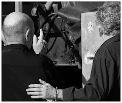
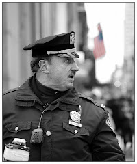
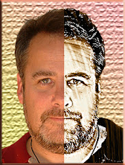
I love the picture of this NYC cop about to tell someone off. The shot was taken at the St. Patrick's Day Parade last year. Sheree and I were up very early, staking out our places on the parade route...because no one knows how to throw parades like New Yorkers do.
I wanted the treatment of the cop to be in very sharp focus. I wanted the gaffing tape repair to his radio to be sharp. But the picture simply refused to pop until I allowed the only thing in color to be that "way out of focus flag" in the background.
You recognize it, of course. But the line from the cop's eye runs directly across the flag and off the image. That's what makes it one of my all-time favorite pictures.
To create this look is pretty basic. First you make a COPY of your color picture, you DESATURATE the top cop layer and use your Eraser Tool to remove the black and white flag, allowing the color flag on the layer beneath to shine through. Alternately, you can use a selection tool to select the flag and press DELETE.
If you are using CS3 to desaturate your photo, do it with IMAGE> ADJUSTMENTS> BLACK AND WHITE. This addition is one of the absolute best things about CS3. You can desaturate by individual color. It is a seriously way cool thing. Try to suppress the "ooooo" and "ahhhhh" reflex as you see what it does as you move those sliders around. I dare you.
Think about the techniques you can use this for. Remember all those sappy pictures with little kids dressed up like adults giving each other roses...and the only actual COLOR in the photo was the flower? They were very powerful visuals. Think about applying your little splash of color to an object you have put on a Dynamic Point on the Rule of Thirds. The very notion of all the possibilities of preselecting one color area amidst a sea of black and white makes my head hurt. (But it's a good hurt.)
Think about going beyond Black and White and making the picture sepia (IMAGE> ADJUSTMENTS> PHOTO FILTER) and introducing a splash of color to that image. You get it, right? The possibilities are endless.

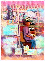
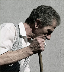
What makes a picture stand out? It stands out because it's a visual someone relates to, right? Endless pictures of Uncle Ned making a big show of picking his nose each time someone turns the camera on him get pretty boring very quickly. Okay. They get boring immediately.
But how about a guy who has dyed his moustache green for St. Pat's Day? I like this picture too -- and there's very little Photoshop in it. It makes an interesting visual: the curve of his face, the curve of his moustache...the smile...but where do your eyes go? Uh huh. The moustache. Why? Because it's the only element of the picture that doesn't make sense.
Our eyes send the picture to our brain and our brain sends it back with the question: "Are you SURE it's green?" We keep looking and, sure enough, it is. Confirmation goes back to the brain and before we know it, we have the viewer engaged.
It's the visual juxtaposition that hooks the viewer.
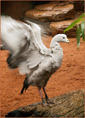
Blending color and motion can have the same effect. The NYC Firefighters had a vision all their own. And I think this picture works as well. What is it a picture of? It's more than a bunch of guys waving flags. It's about pride and patriotism. It's about motion and color.

It's about the guy taking the picture of the people waving flags. It's about a whole bunch of stuff -- which ordinarily would be the kiss of death for a photo. ("Whole bunch of stuff" usually results in a "Picture that isn't of anything at all.") This one is about flags. It's about people. It's about people and flags. It's a line of red white and blue on top and a line of dark clothes beneath.
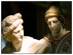
The common element in all three of these graphics is color that draws your eye to a specific part of the graphic. It's the color that draws the eye and insists where the eye looks. It's color that engages us.
We humans are drawn to color like moths are drawn to light. So use that reflex to make your graphics stronger.