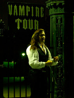
 Okay. I almost didn't post this blog for three reasons. Reason number one: The picture we are going to be working on sucks. The second reason is that posting a picture that sucks and actually admitting that I took it is tough. And the third reason is that, no matter what I do, this project's BEST outcome is that it won't suck -- but may turn out an image that is sort of interesting.
But at Photoshop Basics, we're all about working in the real world. And a real world fact is that sometimes we take cool pictures that stink.
The bottom line, however, is that a picture that stinks when you take it will become only slightly less stinky after you Photoshop it.
But having said all that: Let's say that you're on vacation in New Orleans. You're taking a ghost tour given by a guy who is only slightly more interesting than your average Sherwin Williams paint salesman.
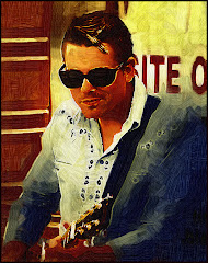
As you pass by Jackson Square you see a guy with long hair standing in front of a dramatic gate about to lead a Vampire Tour.
What do you do? If you're like me, you take a picture. Because it's really dark out already (vampires and ghosts don't come out during the day apparently) you crank the ISO to 1600, point, shoot and pray.
That's what I did and I had high hopes that maybe just maybe I had lucked out and would see a great image on my screen. I mean what goes together better than New Orleans and vampires? I kept trying to convince myself that it would work because it looked okay on the preview screen of my Olympus eVolt 500. (But I have lied to me before...)
What I saw made my whole spirit deflate. That's it. It's a grainy mess. But still there are dramatic touches like the guy's hair and the sign and that great gate. There has to be something you can do to save this image, right?
The answer? "Kinda."
The definitive answer: "Maybe." There's no way I am going to be able to get rid of the grain. There's little I can do about the blurry focus on his hands. But the gate's got detail and the sign can be read so what do you do?
You need to obscure the faults in the picture and make it look like you meant for it to be that way. First you work on the picture and sharpen it. You work with the contrast levels and you ADD grain.
I know what you're thinking. "Did he say ADD grain to a photo that's already grainy?"
Yup. The reason for this is that the grain you added will hide the grain you didn't want there in the first place. In effect, we're evening it out and making it look as though we, photographic geniuses that we are, PLANNED it to look grainy and creepy.
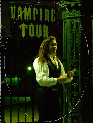
Take your Elliptical Marquee Tool (which is my nomination for Most Pretentious Name For A Tool in Photoshop) and define a circle in the middle of your picture. We want most of the image here to work on. Next you go to Select> Inverse so that the outer border is selected.
Make this a nice, deeply grained desaturated (which is a fifty dollar way of saying "made into Black and White") border. If you are one of the fortunate few that can afford Alien Skin's Exposure 2, you will find a wealth of settings to add a little color to the picture. We're trying to create an aged look.
Press Control+J to create a new layer and work on your border.
The cool part is coming. Remember fingerpaints? Take your Smudge Tool and work all along the circle. The idea here is to create a sort of hazy poorly defined border for the next few effects we are planning to apply. Be careful around the "V" in "Vampire" because this needs to be readable. (After all, where's the allure in an "Ampire Tour?")
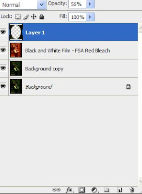
If you are following along with another picture, you know that right now it looks REALLY terrible. I agree. But don't give up on me just yet.
Reduce the Opacity on the border layer to about 50%. Allow the "Red Bleach" layer to drop to about 75% so that the third layer (Background copy) comes up just under the main picture.
I know, I know...it's REALLY terrible now, right?
Okay here's where a great plug in comes to the rescue. I am talking about Virtual Painter 5. Apply this to the "Red Bleach" layer using the Watercolor setting.
Take one more Smudge Tool Tour of the outer border. This time you are trying to blend the two layers as smoothly as possible. This is accomplished by blending straight lines to straight lines as on the bars. You still want the circle defined. But you want it to look more like an ill defined pool of light. This serves to highlight the areas where the image is strong (the gate, the sign the guy) and minimize the places where it seriously sucks.
When you're done the result should be the smooth transition between the artwork and the border. It should look something like this.
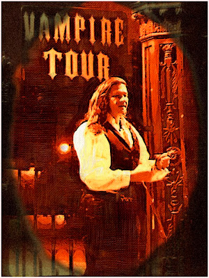
Is it a great picture? Nope. I still don't think horrible photography can be saved by Photoshop. But you can at least make it more interesting to look at.
That's what's been done with this picture. It's more interesting.
And it doesn't suck.
















1 comment:
really good blog; learnt many things. am a big fan of photoshop and wanted to design an angel one day that just mirrors a real angel...
Cheers
http://www.photoshoptutorials.org.uk
Post a Comment