Showing posts with label Cropping Pictures. Show all posts

Wednesday, July 23, 2008

Pictures vs Snapshots

West Edmonton Mall is just down the street from my house. In that mall they have a "life sized" replica of one of Christopher Columbus's ships. It is sponsored by Kodak.

There used to be a sign there suggesting where tourists might want to take a picture from. (Oddly, this was also sponsored by Kodak...in the dark days of film before digital became the norm.) I would watch as tourist after tourist lined up so they could stand there and snap a shot of the Big Boat.

I suspect that they each wound up with a decent picture. And it's obvious they weren't trying to make graphic art. They were just wanting to take a decent picture. They wanted to make a documentary picture that says "This is what it looked like. And I was there." This is a perfectly cool reason for taking a snapshot. If you are a tourist.

Graphic artists, on the other hand, are trying to make graphic art...which is why the job description fits so well. At our recent Capital X celebration, this booth caught my eye. While I am not entirely sure what Frozen Dessert actually is, I thought the very best way to present it was to use the lines in both of the ice cream cones and the lettering to point up to the dramatic sky. For this graphic I was not caring so much that the picture itself be a documentary as I was in showing the towering cone reaching for the sky. It is an absurd concept, huh?

Tweety, on the other hand had been abandoned somewhere on the midway. I suspect someone spent $4,000 trying to win it. Tweety abandoned wasn't a particularly interesting picture. When my wife put Tweety (I've never been sure if Tweety is a boy or a girl, by the way) on a garbage can with a Navy sticker the colors, textures and contrast really popped.

I played around with putting crosshairs in the middle of Tweety's forehead, but in the end I decided to leave it the way it was.

The last fair picture is a good example of trying to take a picture of a PART of something to give a sense of the overall thing. This ride was in Kidsworld and had a wonderful rusty look to it. Colors and glass, textures and life just crackled from it as a subject.


As a straight graphic, it didn't work. So I made a selection of a border within the picture (using the Rectangular Marquee Tool and then going to Select > Inverse). The I took the Dodge tool (found in the toolbox) and set the Exposure to about 50% and very gently darkened the border.

You'll see that the dead center of the flower places in the upper right Dynamic Point in the Rule of Thirds. That is what makes the picture work.

Here are Three Great Rules For Taking A Picture That Isn't The Same As Everyone Else Is Taking And Maybe Even Getting Graphic Art Out Of It (TGRFTAPTITSAEEITAMEGGAOOI for short):

1) Try a different angle. If everyone else is taking a straight on shot of a Ferris Wheel, try standing under it and shooting upward. Try standing across from it and the angles that way. Get above it if you can. You'll be surprised at what you see.

2) Take LOTS of pictures. It's digital. Relax. What doesn't work you can delete, right? So snap away like crazy and then delete like crazy when you see how they turned out. You need to expect that most of the pictures are going to suck. That's okay. Cause one of them won't...

3) Crop like a Crazy Person. Remember that "Undo" is a wonderful command. I use it a lot. Really. Don't be afraid to skew the picture wildly to one side, or crop out a panel...or break the whole picture into panels. You'll start seeing things in the shot you never knew were there. That's where the art comes from.

Don't stand where everyone else is standing. Go the other way. Take chances with your shots. Try different exposure compensations, try different shutter speeds. Try different Scene Modes. Try lots of stuff.

Eventually you will keep doing stuff until it's no longer stuff -- but becomes Stuff You KNOW. And that kind of stuff results in great Graphic Art.

Friday, July 11, 2008

Building Atmosphere into a Travel Picture

Jimmy Durante, that great philosopher, once said "When you know, you know."

If you've ever pressed the shutter button and absolutely known exactly what you are going to do with a photo, you understand what he meant. In each one of the pictures in this blog I knew exactly what I was going to do with them...which is unusual for me since my usual graphic design system is to push things around on the screen until they pretty much look okay.

Part of the graphic artist's job is to create images that tell a story or create a sense of atmosphere. There are a lot of ways to do that.

The image here, a man walking on the beach in Coney Island in NYC, is still one of my favorites. It really shouldn't be -- partially because it breaks a lot of rules. He's not exactly on a dynamic point in the Rule of Thirds. Neither is the gull. But there's something about this image that really speaks to me. It whispers things about solitude and reflection. It's got some of the all time great symbols: a man, small against a vast ocean, a cane, a bird. This is one of those images I can look at for a long time.

There are several things to consider in creating a graphic:

1) Is this a picture better suited to black and white? B&W is a great medium, enjoying a powerful renaissance with the advent of great digital editing tools like Alien Skin's Exposure and Photoshop. If you want a picture to look lonely -- and go directly to the heart, consider Black and White.

2) Would a PASTEL treatment be better? This is easier to do than you might think. Start by making a copy of your main photo (on the PC it's Control J) and work on the copy. Make the copy black and white or use one of the wonderful tools under Image> Adjustments. You might be able to get away with something as basic as "Photo Filter."

Once you have a treatment you like on your copied layer, go to the OPACITY setting on your copied layer and play around with the percentage. You will see the background layer bleeding through and giving you a very pleasing muted color. That's what I did with the Staten Island lifeguard picture here. You'll see some color seeping in on the bottom. If the picture was of higher resolution, you'd also see tinges of color in the umbrella. I added grain to this photo as well to make it more powerful. I used Exposure from Alien Skin to create the grain texture.


3) Think hard about every element in your graphic. It's very simple to take elements out with the Clone tool. You don't want any distractions: you just want to see the main elements. Distractions weaken the impact of your visual -- and can throw off the balance. If it doesn't fit -- cut it out.
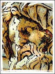
4) Maybe it needs to be a painting? This actor played Ben Franklin. It was a very crisp photograph that was going nowhere fast. Ben just didn't look right in a photo, so I used a number of the Artistic Brush treatments, added a Canvas Texture -- and finished the whole thing off by using my Virtual Painter plug-in (http://www.virtualpainter5.com/) to complete the effect. I use VP a LOT. For my money (and I am very protective of my money) it's the best digital art plug in out there. You can get a fully functioning free trial.

5) Crop Cleverly! A lot of people zip right past the crop. I can't for the life of me figure out why. Good cropping is critical for an image that works. You must consider all the distractions that detract from the power of the image. You need to really consider the Rule of Thirds. If you pay the proper amount of attention to the crop, you will reach that "AHA!" moment when you know the picture is perfect.

Because as Durante said: "When you know, you know."

Thursday, July 10, 2008

The Art of the Crop

Way back in the olden days when dinosaurs ruled the earth, photographers used to have to go into darkrooms filled with the stink of chemicals and painstakingly figure out the very best way to print a picture.

Cropping the pic was a matter of positioning photo paper under an enlarger, moving it up or down, refocussing and finally exposing the paper to light and praying.

Photoshop and the hoard of digital editing software make the job much easier. Best of all? Nothing stinks.

The girl in this picture was giving away free hugs in Union Square in New York City. (Yes...I got one.) When I asked her why she was hugging strangers, she told me "There needs to be more love in the world."

Uh huh. My wife didn't buy it either.

But it makes an interesting picture, right? A pretty girl smiling at the camera and holding up a sign with interesting words written on it. I had almost talked myself into thinking this was the finished photo. She's engaging and the picture almost works, based on the subject matter itself.

But the job of the graphic artist is always to make the picture better. We need to ask ourselves how the picture can be made stronger...and what we can do to cut back on meaningless detail or any detail that doesn't strengthen our subject.

So let's plan the crop, shall we?

The guy's feet and hands are a huge distraction on the right side of the picture. They've got to go. And then there is the whole Rule of Thirds thing. (There's a complete blog entry about this a page or two back, by the way.) To briefly summarize: the Rule of Thirds asks you to put an imaginary "Tic Tac Toe" grid over the picture. The four areas where the lines intersect are called "Dynamic Points." For professional results, you need to put your main subject on one of those Dynamic Points.

What is the subject? The girl. What's the secondary subject? The sign. The Rule of Thirds makes the crop easy. We can cut out the guy, bring the main subject onto a Dynamic Point and build a much stronger visual. Take a good look at the two pictures above. See how perfectly following the Rule of Thirds allowed us to remove tons of meaningless detail and strengthen the main message of the photo.

"Every face tells a story." So does every graphic. You want to tell that story as simply as possible with as much precision as you can muster. That means no meaningless bits. It means deciding if the space you choose to allow around your subject serves to make the photo better or whether it is just cluttering your image. If it clutters it up, crop it out.

Someone is going to write in and talk to me about "Negative Space." This is the notion that putting space around the main subject actually ads to the overall impact of the photo. And, while Negative Space can be very effective in enhancing your graphic, it is often just an excuse for wimpy cropping.

Ask yourself the Three Questions of the Crop:

1) Is my Main Subject on one of the Dynamic Points?

2) Is there meaningless poop in my graphic? Everything should have a REASON to be there. If it doesn't have a reason to be on your image, delete it. Poop is poop.

3) Does the graphic say what I WANT it to say? I will often do my best with an image. Then I will put it away for a couple of days. When I re-open it, I see it with fresh eyes. I'll often find that the stuff I thought was so very clever when I was doing it just looks dumb now.