 Jimmy Durante, that great philosopher, once said "When you know, you know."
If you've ever pressed the shutter button and absolutely known exactly what you are going to do with a photo, you understand what he meant. In each one of the pictures in this blog I knew exactly what I was going to do with them...which is unusual for me since my usual graphic design system is to push things around on the screen until they pretty much look okay.
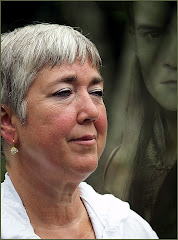
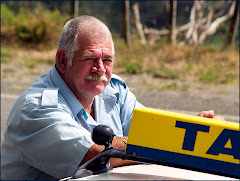
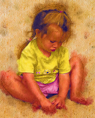
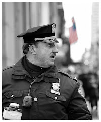
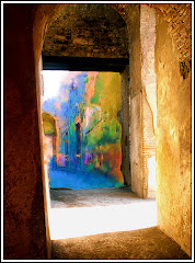
Part of the graphic artist's job is to create images that tell a story or create a sense of atmosphere. There are a lot of ways to do that.
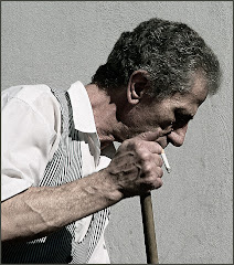
The image here, a man walking on the beach in Coney Island in NYC, is still one of my favorites. It really shouldn't be -- partially because it breaks a lot of rules. He's not exactly on a dynamic point in the Rule of Thirds. Neither is the gull. But there's something about this image that really speaks to me. It whispers things about solitude and reflection. It's got some of the all time great symbols: a man, small against a vast ocean, a cane, a bird. This is one of those images I can look at for a long time.
There are several things to consider in creating a graphic:
1) Is this a picture better suited to black and white? B&W is a great medium, enjoying a powerful renaissance with the advent of great digital editing tools like Alien Skin's Exposure and Photoshop. If you want a picture to look lonely -- and go directly to the heart, consider Black and White.
2) Would a PASTEL treatment be better? This is easier to do than you might think. Start by making a copy of your main photo (on the PC it's Control J) and work on the copy. Make the copy black and white or use one of the wonderful tools under Image> Adjustments. You might be able to get away with something as basic as "Photo Filter."
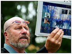
 Once you have a treatment you like on your copied layer, go to the OPACITY setting on your copied layer and play around with the percentage. You will see the background layer bleeding through and giving you a very pleasing muted color. That's what I did with the Staten Island lifeguard picture here. You'll see some color seeping in on the bottom. If the picture was of higher resolution, you'd also see tinges of color in the umbrella. I added grain to this photo as well to make it more powerful. I used Exposure from Alien Skin to create the grain texture.
 3) Think hard about every element in your graphic. It's very simple to take elements out with the Clone tool. You don't want any distractions: you just want to see the main elements. Distractions weaken the impact of your visual -- and can throw off the balance. If it doesn't fit -- cut it out.
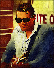
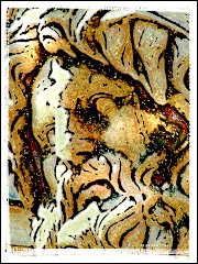
4) Maybe it needs to be a painting? This actor played Ben Franklin. It was a very crisp photograph that was going nowhere fast. Ben just didn't look right in a photo, so I used a number of the Artistic Brush treatments, added a Canvas Texture -- and finished the whole thing off by using my Virtual Painter plug-in (http://www.virtualpainter5.com/) to complete the effect. I use VP a LOT. For my money (and I am very protective of my money) it's the best digital art plug in out there. You can get a fully functioning free trial.
5) Crop Cleverly! A lot of people zip right past the crop. I can't for the life of me figure out why. Good cropping is critical for an image that works. You must consider all the distractions that detract from the power of the image. You need to really consider the Rule of Thirds. If you pay the proper amount of attention to the crop, you will reach that "AHA!" moment when you know the picture is perfect.
Because as Durante said: "When you know, you know."


No comments:
Post a Comment