 Way back in the olden days when dinosaurs ruled the earth, photographers used to have to go into darkrooms filled with the stink of chemicals and painstakingly figure out the very best way to print a picture.
Cropping the pic was a matter of positioning photo paper under an enlarger, moving it up or down, refocussing and finally exposing the paper to light and praying.
Photoshop and the hoard of digital editing software make the job much easier. Best of all? Nothing stinks.
The girl in this picture was giving away free hugs in Union Square in New York City. (Yes...I got one.) When I asked her why she was hugging strangers, she told me "There needs to be more love in the world."
Uh huh. My wife didn't buy it either.

But it makes an interesting picture, right? A pretty girl smiling at the camera and holding up a sign with interesting words written on it. I had almost talked myself into thinking this was the finished photo. She's engaging and the picture almost works, based on the subject matter itself.
But the job of the graphic artist is always to make the picture better. We need to ask ourselves how the picture can be made stronger...and what we can do to cut back on meaningless detail or any detail that doesn't strengthen our subject.
So let's plan the crop, shall we?
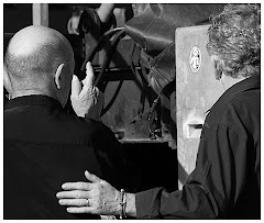
The guy's feet and hands are a huge distraction on the right side of the picture. They've got to go. And then there is the whole Rule of Thirds thing. (There's a complete blog entry about this a page or two back, by the way.) To briefly summarize: the Rule of Thirds asks you to put an imaginary "Tic Tac Toe" grid over the picture. The four areas where the lines intersect are called "Dynamic Points." For professional results, you need to put your main subject on one of those Dynamic Points.
What is the subject? The girl. What's the secondary subject? The sign. The Rule of Thirds makes the crop easy. We can cut out the guy, bring the main subject onto a Dynamic Point and build a much stronger visual. Take a good look at the two pictures above. See how perfectly following the Rule of Thirds allowed us to remove tons of meaningless detail and strengthen the main message of the photo.
"Every face tells a story." So does every graphic. You want to tell that story as simply as possible with as much precision as you can muster. That means no meaningless bits. It means deciding if the space you choose to allow around your subject serves to make the photo better or whether it is just cluttering your image. If it clutters it up, crop it out.
Someone is going to write in and talk to me about "Negative Space." This is the notion that putting space around the main subject actually ads to the overall impact of the photo. And, while Negative Space can be very effective in enhancing your graphic, it is often just an excuse for wimpy cropping.
Ask yourself the Three Questions of the Crop:
1) Is my Main Subject on one of the Dynamic Points?
2) Is there meaningless poop in my graphic? Everything should have a REASON to be there. If it doesn't have a reason to be on your image, delete it. Poop is poop.
3) Does the graphic say what I WANT it to say? I will often do my best with an image. Then I will put it away for a couple of days. When I re-open it, I see it with fresh eyes. I'll often find that the stuff I thought was so very clever when I was doing it just looks dumb now.


No comments:
Post a Comment