 West Edmonton Mall is just down the street from my house. In that mall they have a "life sized" replica of one of Christopher Columbus's ships. It is sponsored by Kodak.
There used to be a sign there suggesting where tourists might want to take a picture from. (Oddly, this was also sponsored by Kodak...in the dark days of film before digital became the norm.) I would watch as tourist after tourist lined up so they could stand there and snap a shot of the Big Boat.
I suspect that they each wound up with a decent picture. And it's obvious they weren't trying to make graphic art. They were just wanting to take a decent picture. They wanted to make a documentary picture that says "This is what it looked like. And I was there." This is a perfectly cool reason for taking a snapshot. If you are a tourist.
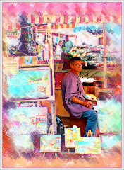
Graphic artists, on the other hand, are trying to make graphic art...which is why the job description fits so well. At our recent Capital X celebration, this booth caught my eye. While I am not entirely sure what Frozen Dessert actually is, I thought the very best way to present it was to use the lines in both of the ice cream cones and the lettering to point up to the dramatic sky. For this graphic I was not caring so much that the picture itself be a documentary as I was in showing the towering cone reaching for the sky. It is an absurd concept, huh?

Tweety, on the other hand had been abandoned somewhere on the midway. I suspect someone spent $4,000 trying to win it. Tweety abandoned wasn't a particularly interesting picture. When my wife put Tweety (I've never been sure if Tweety is a boy or a girl, by the way) on a garbage can with a Navy sticker the colors, textures and contrast really popped.
I played around with putting crosshairs in the middle of Tweety's forehead, but in the end I decided to leave it the way it was.
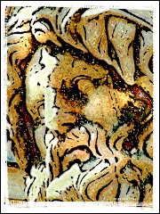
The last fair picture is a good example of trying to take a picture of a PART of something to give a sense of the overall thing. This ride was in Kidsworld and had a wonderful rusty look to it. Colors and glass, textures and life just crackled from it as a subject.

As a straight graphic, it didn't work. So I made a selection of a border within the picture (using the Rectangular Marquee Tool and then going to Select > Inverse). The I took the Dodge tool (found in the toolbox) and set the Exposure to about 50% and very gently darkened the border.
You'll see that the dead center of the flower places in the upper right Dynamic Point in the Rule of Thirds. That is what makes the picture work.
Here are Three Great Rules For Taking A Picture That Isn't The Same As Everyone Else Is Taking And Maybe Even Getting Graphic Art Out Of It (TGRFTAPTITSAEEITAMEGGAOOI for short):
1) Try a different angle. If everyone else is taking a straight on shot of a Ferris Wheel, try standing under it and shooting upward. Try standing across from it and the angles that way. Get above it if you can. You'll be surprised at what you see.
2) Take LOTS of pictures. It's digital. Relax. What doesn't work you can delete, right? So snap away like crazy and then delete like crazy when you see how they turned out. You need to expect that most of the pictures are going to suck. That's okay. Cause one of them won't...
3) Crop like a Crazy Person. Remember that "Undo" is a wonderful command. I use it a lot. Really. Don't be afraid to skew the picture wildly to one side, or crop out a panel...or break the whole picture into panels. You'll start seeing things in the shot you never knew were there. That's where the art comes from.
Don't stand where everyone else is standing. Go the other way. Take chances with your shots. Try different exposure compensations, try different shutter speeds. Try different Scene Modes. Try lots of stuff.
Eventually you will keep doing stuff until it's no longer stuff -- but becomes Stuff You KNOW. And that kind of stuff results in great Graphic Art.


No comments:
Post a Comment